
Reviewed by Rudy Vega •
The cover of Julie Blackmon’s Midwest Materials depicts the following: four children-all of which have their faces turned away from us, the viewers. They are caught in mid-stride–two girls skipping towards the wall of the building marked by the name of the book- Midwest Materials, while another has arms stretched skyward as if just having sent a gold-colored ball aloft. The fourth child is a jeans wearing shirtless young boy moving away from the three girls and carrying a stick. In addition to the gold ball, a soccer ball is also floating in space, but lacking evidence of the source of its propulsion. Its shadow, along with the shadows of the others, cast courtesy of a bright sunny day. The children seem to be playing independently of each other, engaged in their own activity. And then a shadow-disembodied and positioned-strategically so- in the bottom right-hand corner of the scene.
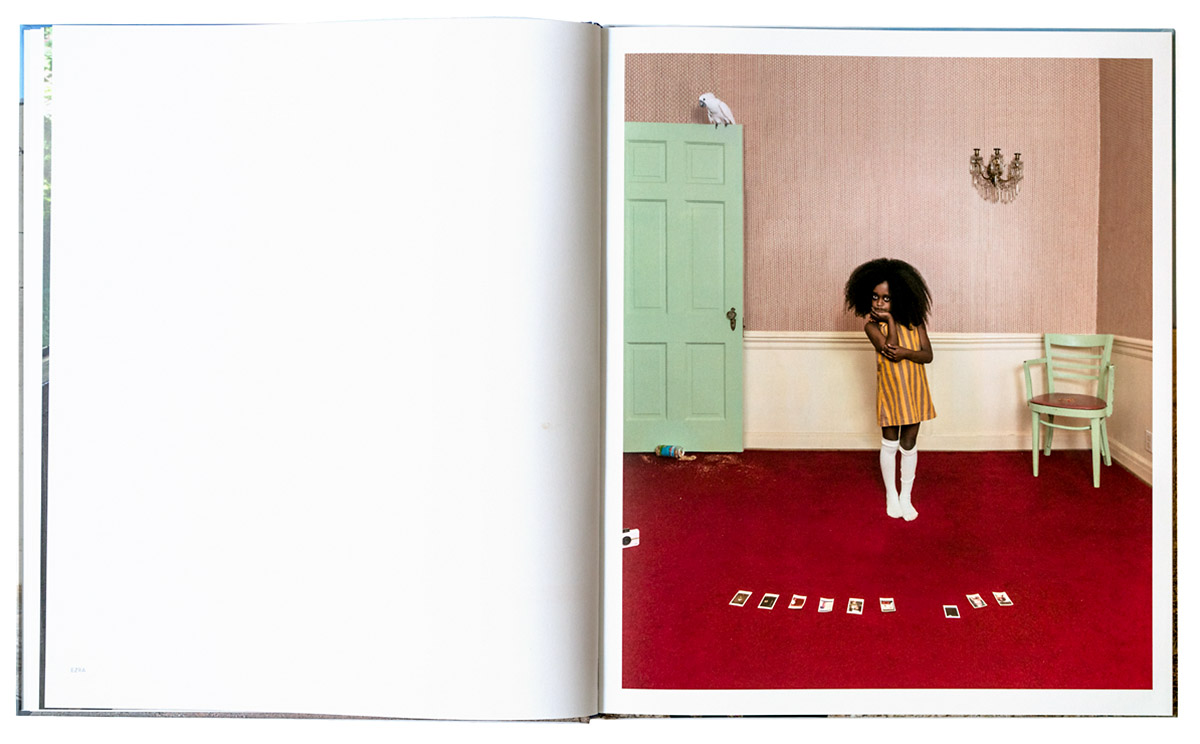
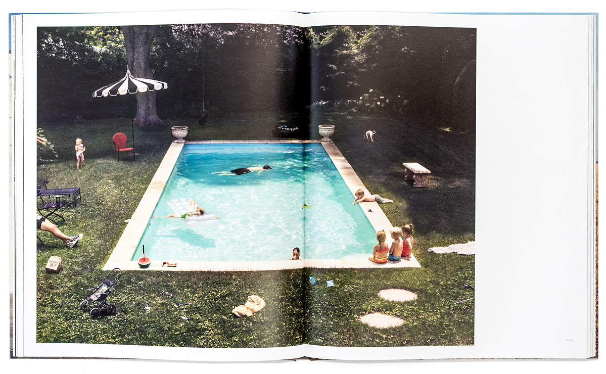
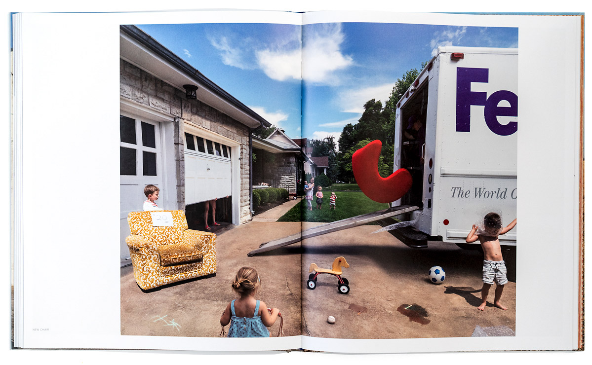
A careful description of the cover is in order as it hints to the process Blackmon employs throughout Midwest Materials. Her staged photographs are meticulously choreographed leaving nothing to chance and every detail-a result of careful planning. The colors throughout the scene, coupled with the gestures and placement of the children contribute to an overall composition that at first glance is meant to appear candid. But while Ms. Blackmon’s children are in fact doing what children do best-playing, Blackmon is interested in creating an underlying element of mystery to the proceedings. So, while the operative word throughout Midwest Materials is fun, there lurking in the figurative shadows, a disrupter.
Midwest Materials follows Domestic Vacations and Homegrown, marking the third installment of her ongoing investigations of domesticity and life with kids on the verge of chaos. (a full review of Domestic Vacations by my colleague Douglas Stockdale). While initially inspired by the paintings of seventeenth century Dutch painter Jan Steen, Blackmon has firmly planted her own seal on the photographic tableau. Deftly strategic, she exploits the tableau in no uncertain terms to raise questions while creating a gateway for a deeper dive.
She guides viewers to look past the surface veneer of normalcy to consider the details in an otherwise mundane activity. With a measured dose of ambiguity, Blackmon displays latent dangers that, if fully realized, would become a veritable minefield–tilting the equation from fun to apprehension. And that is where Midwest Materials shine. It speaks to a maturation of Blackmon’s approach and execution of her ideas. Never didactic, Ms. Blackmon welcomes the viewer to her domain with open arms, but with the caveat that all may not be as it seems.
Domestic Vacations and Homegrown had a level of built in naivete which she used to full advantage. Her continued vested interest in the staged photo has allowed her to grow into and assume multiple roles, including, but certainly not limited to, photographer, editor, director, set designer, costume/make-up artist and even, cat wrangler. The experience of wearing multiple hats pays off big in Midwest Materials, displaying a level of sophistication of said experience, and now utilizing the language of naivete as a tactical instrument. One imagines Blackmon at her desk–in her den or basement perhaps–her private situation room, creating schematics drawing up plans with sharpies, yellow highlighters, post it notes, polaroid’s and push pins with yarn! It would make sense given the level of finish her photographs display. And indeed, therein lies the beauty of her work and the genius behind her madness, for it is genius to make something complicated appear to be simple or natural–unbothered by the darker realities lurking in the shadows or in the blurry depictions of motion.
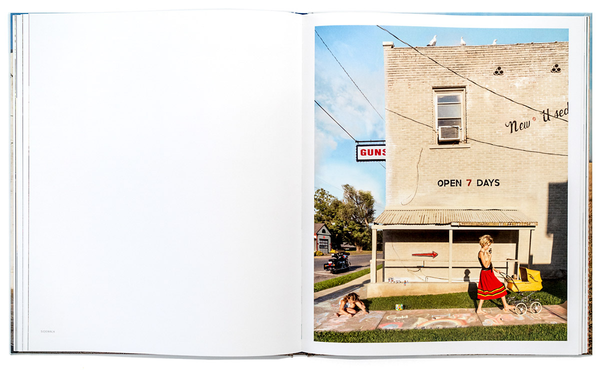
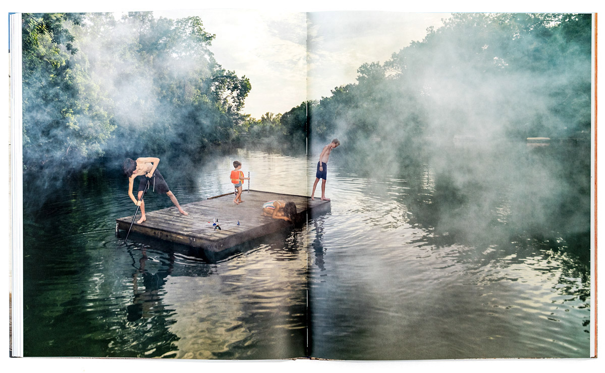
Midwest Materials comprises 108 pages, 45 of which are color plates and an introductory essay by Leah Ollman. The arrangement of the photographs varies throughout the book with a majority of them sized to span the gutter. Those occupy one full page plus a portion of the opposing page as well. Never are two images facing each other. Some photographs are full bleed blow-ups, in the service of providing greater detail. Blackmon’s preferred composition has the camera square up to the scene unfolding in real time. The notable exception is when she has employed a bird’s eye view of a scene, such as Spray Paint and River. The layout of the book has the viewer turning each page in anticipation of what follows.
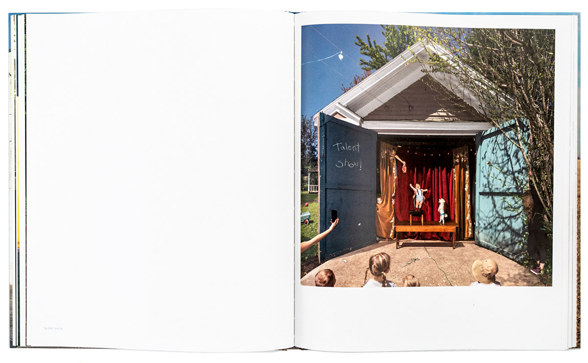
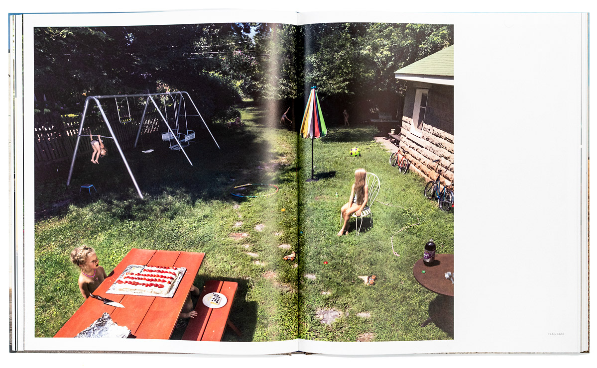
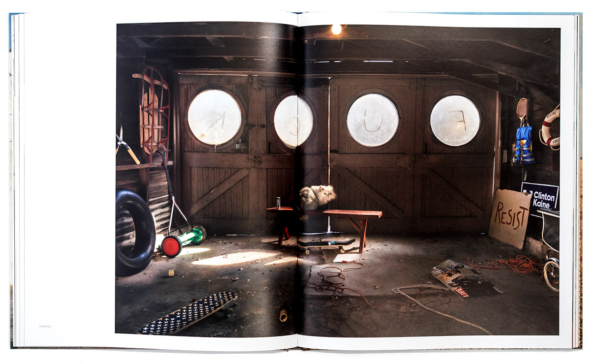
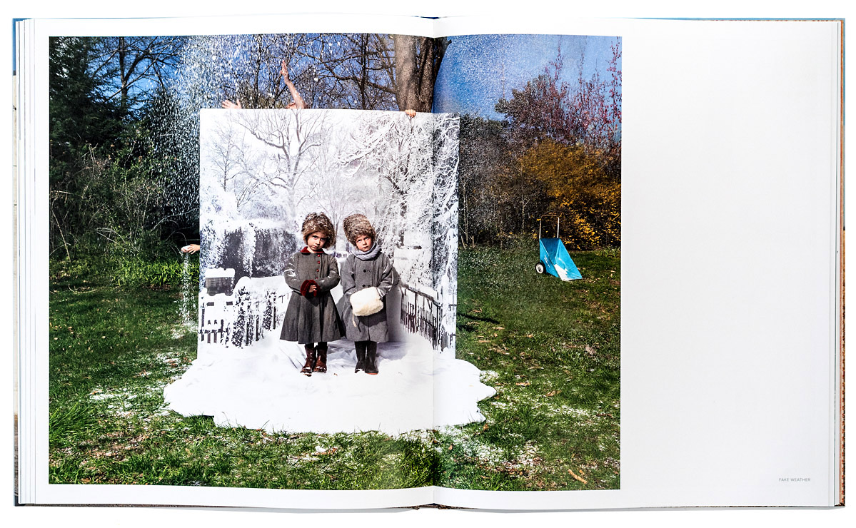
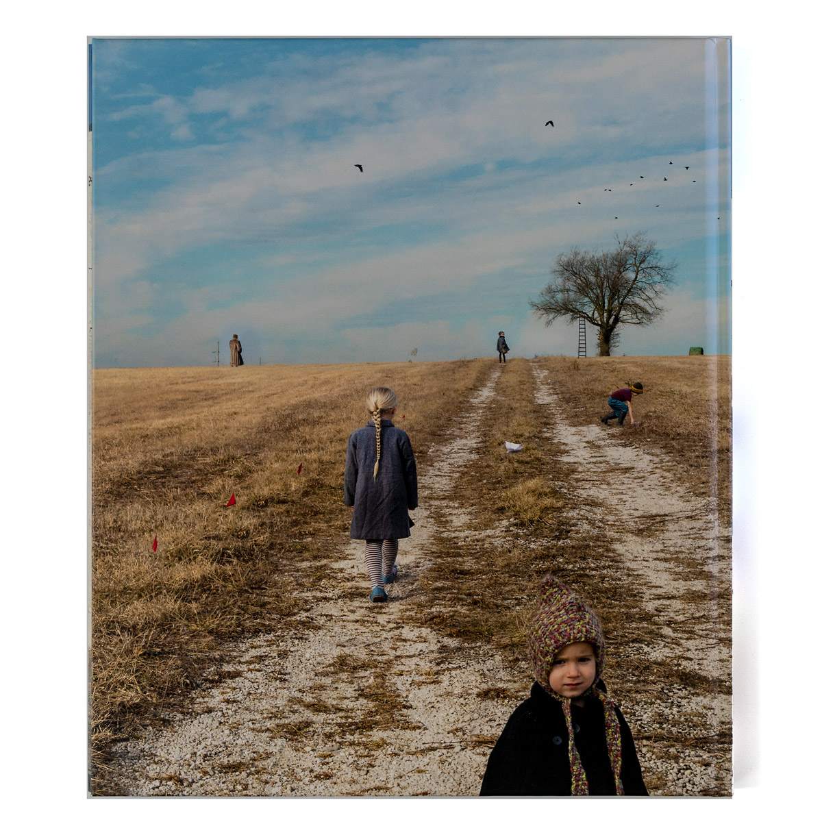
Then there is Trapped – the only photo of Midwest Materials not to include a child, save for an outstretched arm and hand with the child’s index finger caught in the moment of completing a profanity written in the dusty windows of the garage. Trapped has the distinction of being the most overtly political image of this collection. It marks a turning point as the remaining images point to darker themes shifting the swinging pendulum away from unbridled fun towards a more “Stranger Things” vibe–to borrow a contemporary connection from popular culture. There is no severed ear just beyond the white picket fence to be found here, but it could foretell an evolving narrative in Blackmon’s approach. Two other images of note, include Fake weather and Flag Cake which signal a threat to the last bastion of innocence–our children.
There is plenty to read into each image of Midwest Materials and each image is an invitation to do just that. Repeated viewings illuminate the inherent compulsion to interpret what Blackmon has laid out for our appreciation. Blackmon in Midwest Materials has crafted a masterful work of theater and in the end reminds us of art’s ability to inspire meaningful thought.
_____
Rudy Vega is a Contributing Editor and resides in Irvine, Ca. He is a fine art photographer and writer.
_____
Julie Blackmon – Midwest Materials
Photographer: Julie Blackmon (born and lives in Springfield, Missouri)
Publisher: Radius Books, Santa Fe, New Mexico, (copyright 2022)
Essay: Leah Ollman
Language: English
Hardcover book, Offset printing, 108 pages, 45 color plates. 11.6 x 13.7 inches. ISBN 978-1-955161-02-2
Editor: Nick Larsen
Book Design: David Chickey & Mat Patalano
_____
Articles and photographs published in the PhotoBook Journal may not be reproduced without the permission of the PhotoBook Journal staff and the photographer(s). All images, texts, and designs are copyright of the authors and publishers.
