Review by Douglas Stockdale •
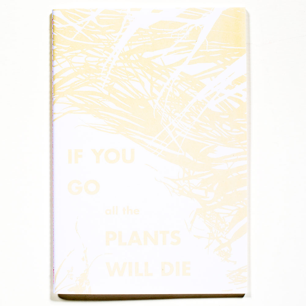
I may not be a relationship expert, but I highly suspect that stating the reason for another person to stay in a relationship is that otherwise if they left all of the plants would die may not be the most enticing of rationales. The book’s title appears to be a retrospective statement about a relationship that Fred Mitchell was experiencing that establishes an underlying conceptual framework for this body of work. When things are not going right, everything is perceived to be in the same sad state of affairs.
Mitchell is visually investigating the question of what does emotional turmoil and sadness look like? The monotone quality of black and white photography is probably well suited to his investigation, but he adds an interesting design twist in how he incorporates emotional color into this artwork.
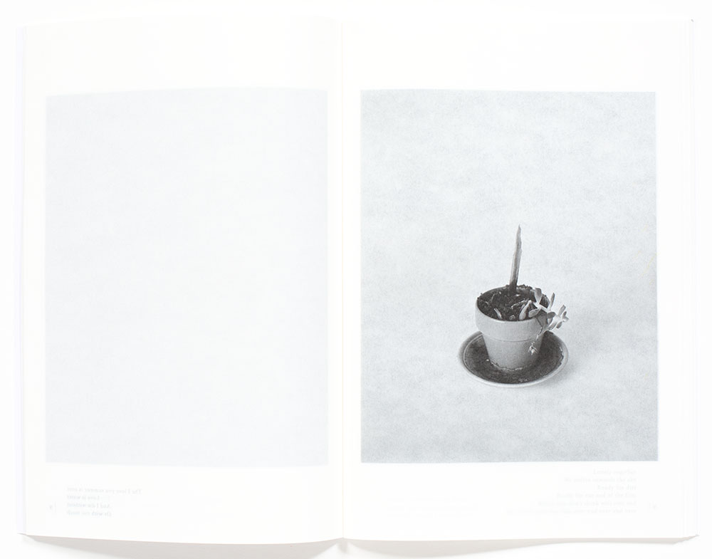
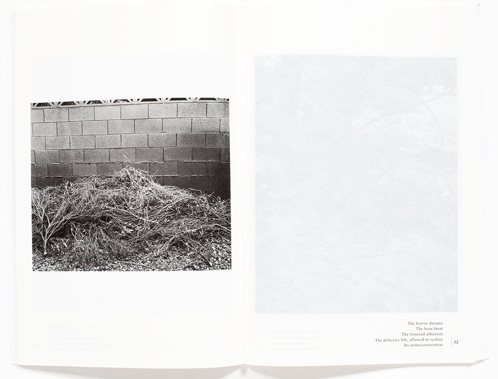
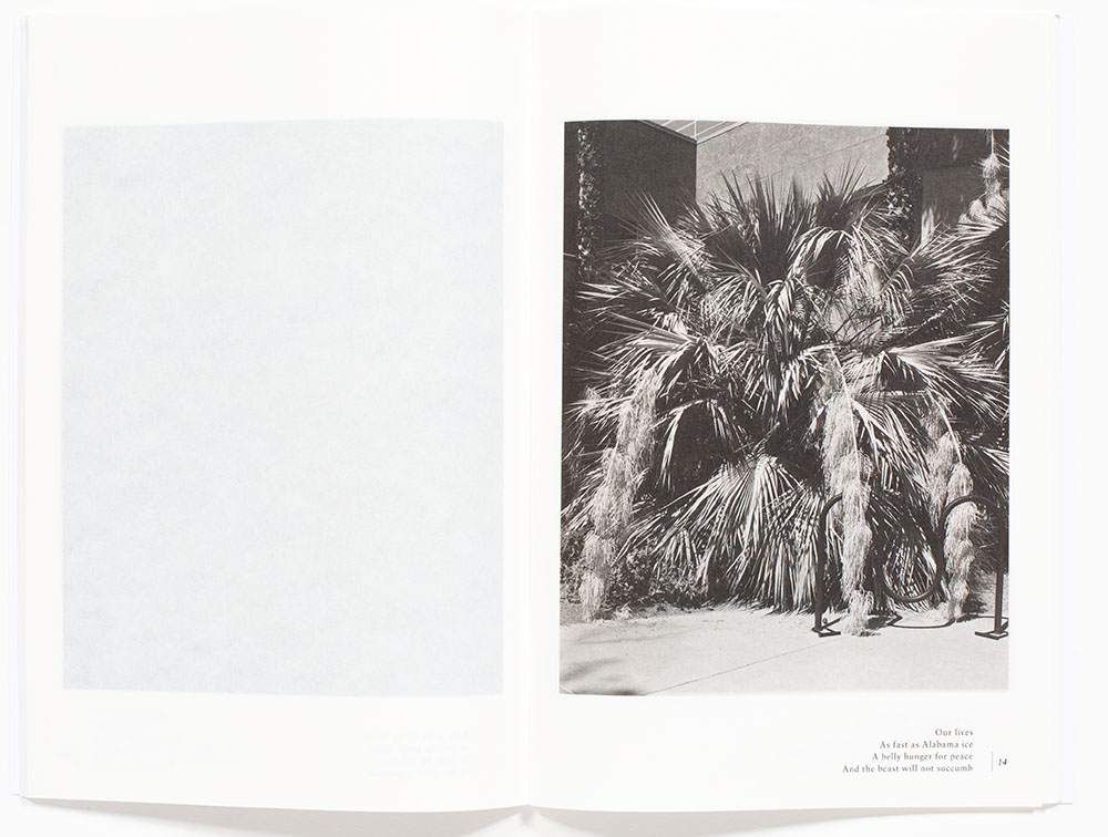
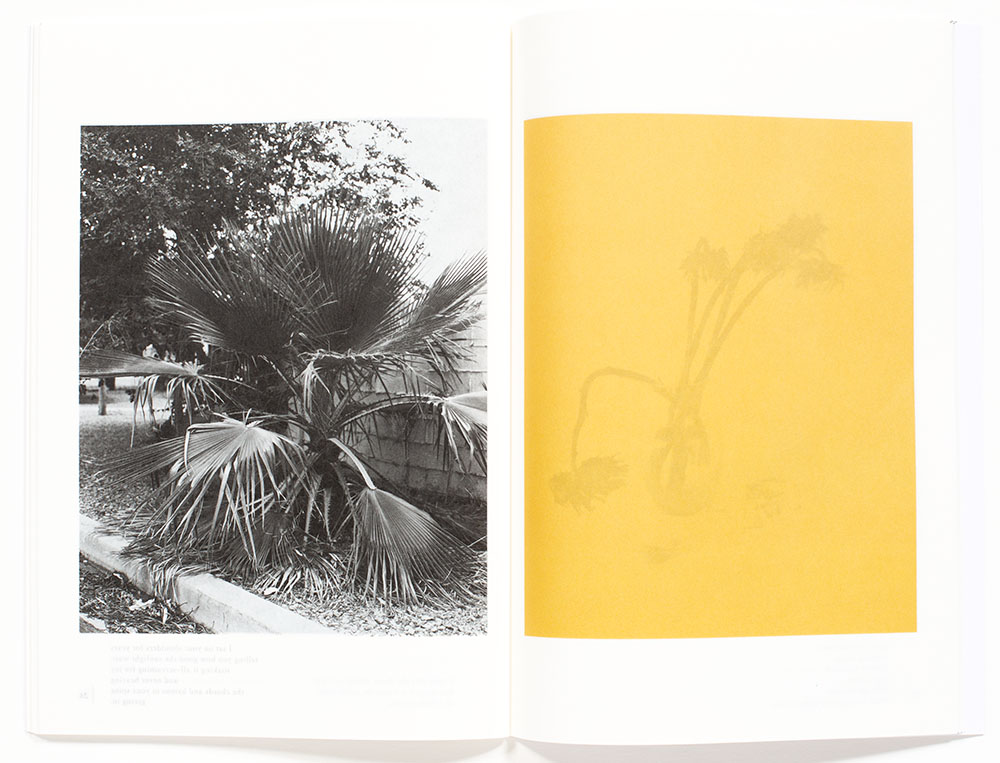
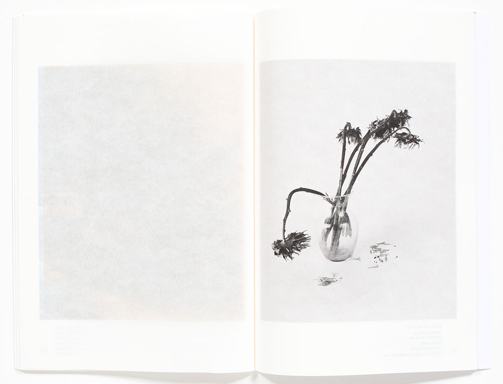
His photographs are a combination of botanical still lifes and urban landscapes. The still life images seem emotional detached, with the botanical objects coolly floating on the page isolated from any environmental context. These studies provide an opportunity for a focused gaze. His botanical subjects have all seen better days as even the pots are either worn or altogether missing. The still life images are juxtaposed with found plants, bushes, parts of trees and other urban vegetation, similarly in a state of decline or showing a lack of care and maintenance.
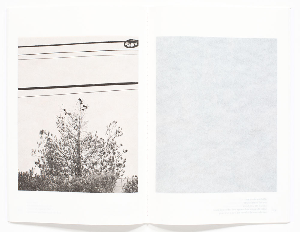
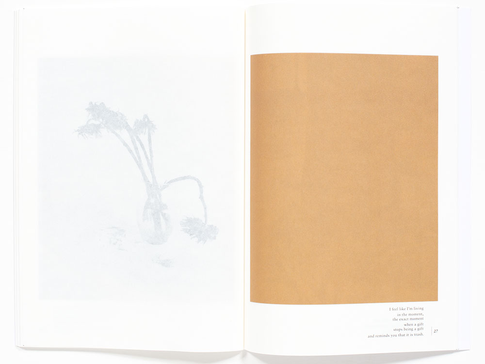
This is a very elegant photobook regarding the design elements briefly mentioned above. Mitchell’s black and white photographs are printed on slightly translucent paper and he utilizes a combination of color fields (blocks) to provide a tonal tint of varying intensities. One combination is when the color block is printed on the opposite side of the page, which provides a background tonal tint to the opposite photograph. Due to the translucency of the paper, the color block side of the page contains a faint image of the photograph printed opposite. The effect is illustrated in by the first- and second-page spreads below. The resulting visual effects can be very subtle.
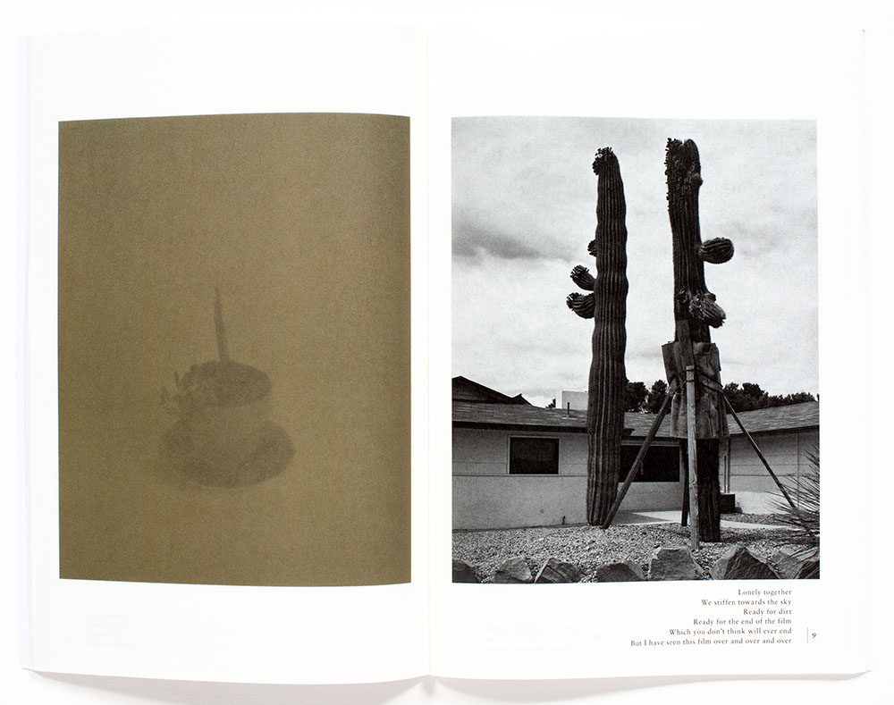
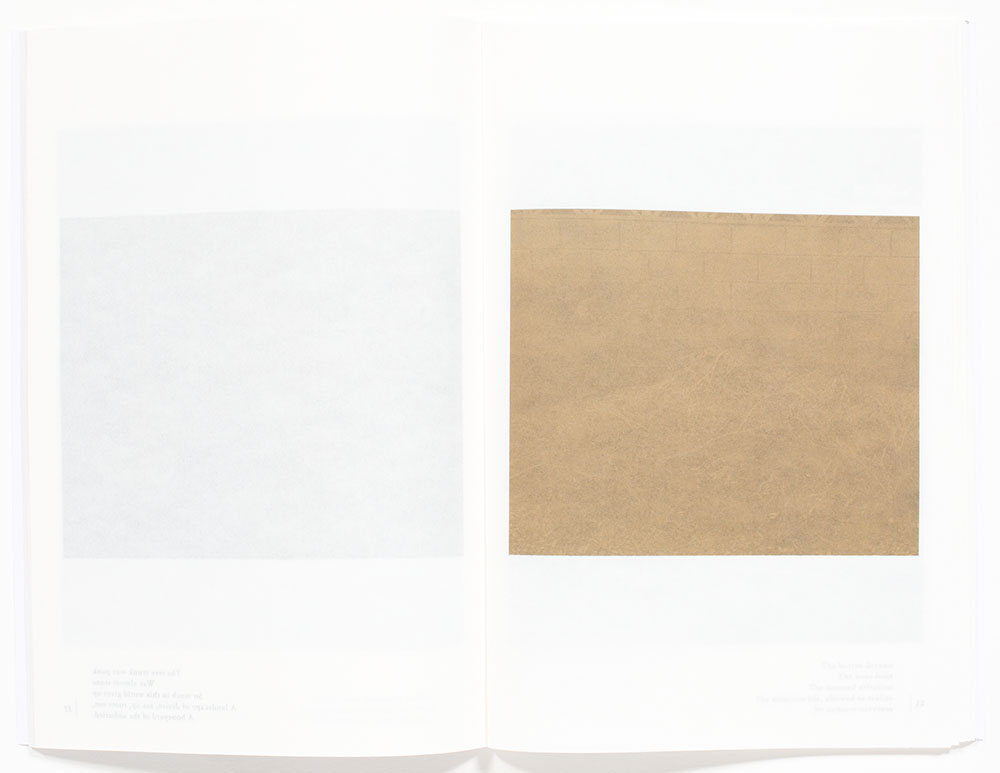
Another combination is a color block printed on one page that is positioned over a black and white photograph printed on the subsequent page, that in turn is juxtaposed over another color block printed on the next page, illustrated on the last three-page spreads below. In this last series below, the botanical still life initially has warmth that progresses to a duller and more somber brown tones, symbolically implying what occurs to cut flowers over time without water. A very delightful sequencing of photographs and color.
The translucent paper correspondingly reduces the contrast of the photographic images that are lacking a bright white and the darker values, such as the second page spread below, appear ‘muddy’. This visual effect may also be due in part to the color field printed on the opposite page. Depending on the choice of color backing the photograph there are some combinations that provide a very gloomy appearance and feeling.
The printed poetic text on the bottom margin of the page also provides multiple readings, as the text can be read through multiple pages, which is only hinted at in the first page spread below. This page design raises an intriguing question; is the text of the poem applicable to the specific page it is printed on or all of the pages that it is readable? Further complicated when a poem is the only printed item, yet due to the translucent nature of the paper, the ghostly photo on the beneath page is barely discernable. These combinations create a complex and layered reading.
A strange design feature of this photobook is the numbering provided is associated with the poetic text, not to the Plate List numbers for the photographic titles that creates an inconsistency and randomness, perhaps inline with the book’s underlying concept. Sometimes things don’t always make sense.
An interesting treatise on the contemplation of unrelenting emotional turmoil.
____
Douglas Stockdale is a visual artist, Senior Editor & founder PhotoBook Journal
____
If You Go All the Plants Will Die, Fred Mitchell
Photographer: Fred Mitchell, German-born American and residing in Los Angeles, California
Publisher: Yoffy Press, Atlanta, GA copyright 2021
Poetry: Derrick C. Brown
Text: English
Stiff covers, In-line sewn spine, plate list, four-color, 9.6 x 6.7 inches, 112 pages, printed by SYL, Barcelona, Spain, ISBN 978-1-949608-24-3
Photobook Designer: Fred Mitchell
_____
Articles & photographs published on PhotoBook Journal may not be reproduced without the permission of the PhotoBook Journal staff and the photographer(s).
