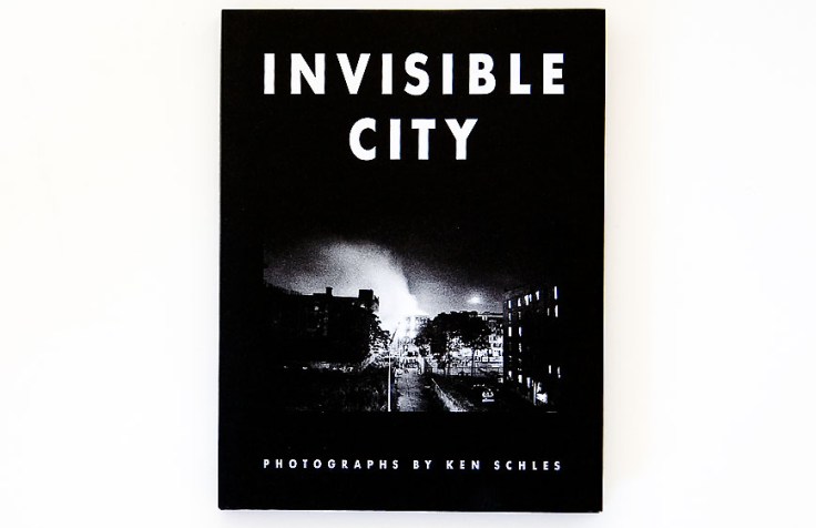
Copyright 2014 Ken Schles
Photographer: Ken Schles (born & resides in Brooklyn, NY)
Publisher: Steidl (Germany)
Excerpts: Lewis Mumford, George Orwell, Jorges Luis Borges, Franz Kafka, Jean Baudrillard
Text: English
Hardcover book with dust jacket, sewn binding, four-color lithography, printed in Germany
Photobook designer: Ken Schles and Jack Woody
Notes: This is a new Steidl version of Schles photobook Invisible City, which was first published by Jack Woody and his Twelvetrees Press in 1988. In an interview with Ken, he states:
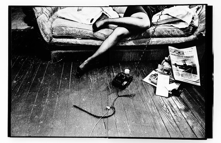
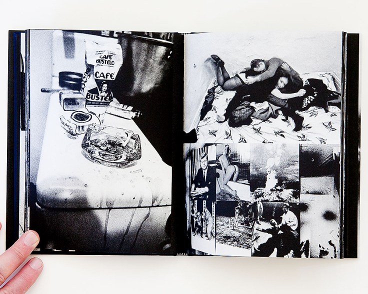
Long story on the prints. I’ll go back to when I first made the work and the struggles I had with the material. I always saw myself as a fairly accomplished printer. I built a dry darkroom in a boarded up room in my old tenement from cobbled parts and pieces of old Omega D2 enlargers. I worked as a custom printer for the likes of Magnum photographers Gilles Peress, Eliott Erwitt, Burt Glinn, Erich Hartmann and others who were quite exacting. After the landlord abandoned the building I added filtered running water to the mix.
Printing my own work, given the limits I was pushing the slow film material at the time, printing had its challenges. Working in low light, the resultant negs were thin and contrasty by nature. The photogravure printing of the first edition of Invisible City gave the work another dimension that was hard to replicate (and played nicely off my very contrasty prints). After the work came out in book form, the work became known in that way. A funny thing to say, but I even identified the work with that gravure printing technique. The fact was that the original/traditional silver gelatin prints didn’t look like the gravure and the gravure didn’t have qualities of the silver prints. The look of the book was something I tried to replicate with available silver papers, largely failing. I shouldn’t say failing: it was simply different. A different interpretation. Over the years I sometimes moved radically far in that interpretation. For a time I used a very warm Hungarian paper called Fortezo. I tried matte papers.
When it came time to work with Gerhard on the reprint he asked how I would like to work the images. We could do a facsimile by two methods: I still had a set of prints the original book was made from and we almost went with that. We could also scan an extant copy of the original book as Gerhard did so wonderfully with the reprint of Fabrik. In that facsimile reprint he reproduced not only the original images, but the structure of the original gravure technique.
But even though I wanted the feel of the original gravure, I didn’t want to scan from the book. That certainly would have been easiest for my situation. But after spending so many years struggling to get the prints just so, I knew there were better solutions to be had with the original printing of Invisible City. Back when I made the original prints papers were slower and burning and dodging laborious. I knew the negs had more information to give up. And while the original IC had a great quality to it, I wasn’t convinced that simply porting it to a new edition using contemporary technology would be the answer either. Contemporary printing is quite better. More detail, more precision …what looked good in 1988 using what was, even then, an archaic process (albeit beautiful process) might not work so well now. I decided to scan everything and work from there. This way I was able to shift a few things… get more detail in the blacks, more detail in the highlights without the image blowing out or getting too flat. And I was able to use the same files to make pigment prints so now there is consistency even across media: pigment prints, offset prints and screen images.
The images look different in the different media and have a different presence, but there is a thread that unites the images now, provided by using the same base scans. But even saying that, the final decision to make the exhibition prints using scans and printing with pigment inks wasn’t a predetermined outcome. Working with Howard Greenberg we explored most every silver paper available, even tested making negs from the digital files and Lama printing onto silver paper. I think we all wanted the traditional “wet” silver materials to work. In the end we came back to the pigment prints I had made myself. They seemed the most direct and “honest.” And then tested all variations of ink jet papers available. In the end I went with the Harman Baryta Gloss: it doesn’t have a strange “artsy” texture to it and doesn’t feel too glossy. Surprising how hard it was to find a paper that simple and clean. In the end I made several hundred prints: for the exhibition for Howard Greenberg and the large show at Noorderlicht in The Netherlands. The prints look fantastic. And I think the years of work I put into fine-tuning shows. Prints were just acquired by the Museum of Fine Arts in Boston, MoCP in Chicago, Museum of the City of New York and the Chicago Art Institute for their permanent collections.
As for the Steidl printing: we used the book that Gerhard printed of Koudelka’s Gypsies as a reference point while on press (that Aperture book was where Gerhard felt he perfected this five plate quadratone technique to replicate the feel of the old gravure process). I’d pull a sheet off press and compare. I think we did a better job with my book. I told Gerhard that. He said, “Well, you hope to get better the more you do it. The Koudelka book was the breakthrough.” He’s been perfecting the technique since and it shows.
Now to compare the two editions? They each use their respective technologies to ultimate ends. I was able to correct a few things in the original after 26 years. But the original has a real quality to it as well. I still love to flip through the two together and compare the differences in printing. Some are obvious, some subtle. Some only I notice. But both printings sing and they sing loudly.
xxx
When I curated Schles Invisible City into the 10×10 American Photobooks exhibition (2013), I stated: A gritty documentary project that brought the essence of Robert Frank into the city. A photobook that is a classic and a wonderful example of the progression in photobook publishing.
Other Ken Schles photobook reviewed on The PhotoBook: Oculus
Cheers


Reblogged this on seeing images, seeing things and commented:
Nice interview with Doug Stockdale from his site The Photobook.
Hi Doug, thanks for posting! We did this breathless interview some time ago now… I would like to add (for the record) that I spoke a little soon an the Whitney purchase fell through. It was an odd turn, but several other institutions stepped in.