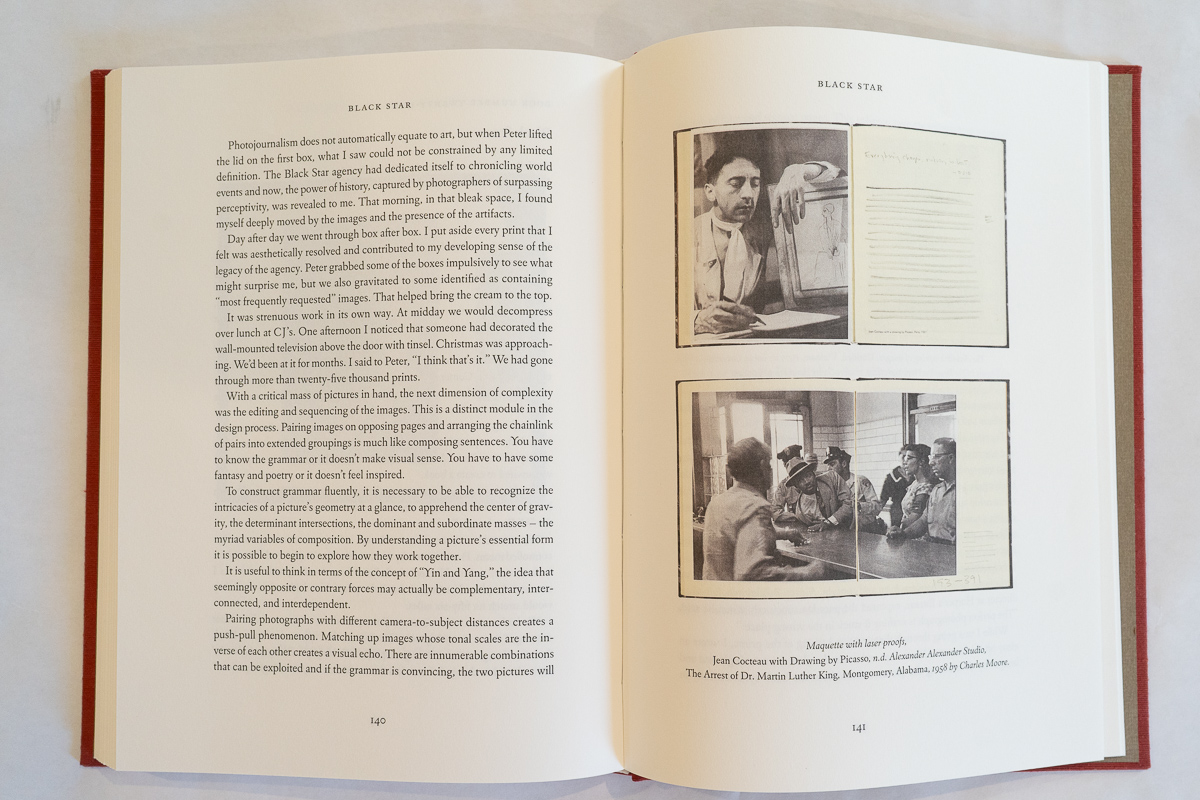
Review by Lee Halvorsen •
This stunning book—a joy to hold and behold—captured and held my attention for hours. Carefully designed to reflect the art of bookmaking itself, this custom volume employs traditional presswork on the cover, bespoke papers throughout, stunning images, and thoughtfully chosen typography, all curated to honor the historical and visual essence of photography and the twenty-two artists it celebrates.
Far more than a traditional photobook, Printer Savant is a masterclass in the physical and emotional art of bookmaking. The volume offers an immersive look at Lumiere Press, where master artisan Michael Torosian prints and publishes hand made books sequencing imagery alongside lead-cast type and hand-bound sheets. The result is a superb exploration of how the photobook can become photography’s ultimate and most definitive medium.
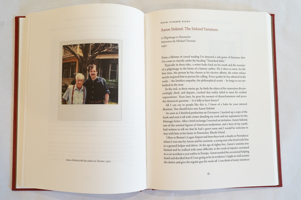
An accomplished photographic artist in his own right, Torosian’s artistic horizons expanded in the late 1970s when he encountered a book printed with cast lead type. Captivated by the exquisite three-dimensional quality of its pages, he became devoted to letterpress printing. During the 1980s, he embarked on an ambitious undertaking, a program, more than a project: to print and publish twenty-two books, each dedicated to a photographer or event that had shaped his understanding of photographic art. The series includes volumes devoted to artists such as Weston, Heath, Siskind, Steichen, Sommer, and others. In these books, photographs are paired with interviews of the artists themselves or, in some cases, essays by those who knew them well. In Printer Savant, Torosian recounts how these encounters came about and how each book gradually developed its own unique identity.
Torosian’s mandate for each volume was simple but profound: offer more than images—capture the photographer’s authentic voice. Every detail, from typeface and paper to cover design and tactile textures, contributes to that cohesive artistic objective. The book itself becomes Torosian’s canvas. This volume is no exception. It serves as both a homage to his three-decade printing and publishing program and a reflection of the extraordinary design and production decisions that shaped each of the twenty-two books. Reading it, I felt as though I was experiencing each of those volumes through a single, carefully crafted lens.
Torosian views book design much as a photographer views composition. Everything matters: the photographer, the images, the historical context, and the physical presentation. He treats the book as a conceptual entity in which every element, whether subtle or expressive, contributes to the whole. Using his words, “The Book as the Medium of Photography.” Each of the twenty-two volumes became the voice and persona of both the photographer and, inevitably, Torosian himself. Printer Savant embodies that same philosophy.
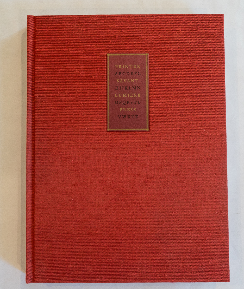
The choices Torosian made regarding paper, typeface, binding, and cover design are deeply personal, and one can only speculate about the artistic instincts that guided their combination. This binding is covered in rust-colored Asahi Japanese book cloth, featuring a plaque and label cast in lead type, letterpress printed on Mohawk Carnival paper, and recessed into a debossed cover panel. The design evokes a composing stick filled with lead type. Simply looking at the book and feeling the texture of its cover transports me elsewhere—to the smell of hot lead, the heat of the workshop, and the rhythmic sound of a working press.
The entire volume was printed using four-color, 10-micron offset lithography. As a result, the reproductions possess exceptional clarity and richness. The images exhibit none of the smearing, fading, or moiré patterns often associated with reproduction; the images could easily hang in a gallery exhibition. No visual artifacts distract from the photographs or the text. The quality is so refined that I initially assumed the book combined offset lithography with traditional press techniques. Instead, I learned that the effect was achieved through careful choices of paper, offset printing processes, and superb color management.
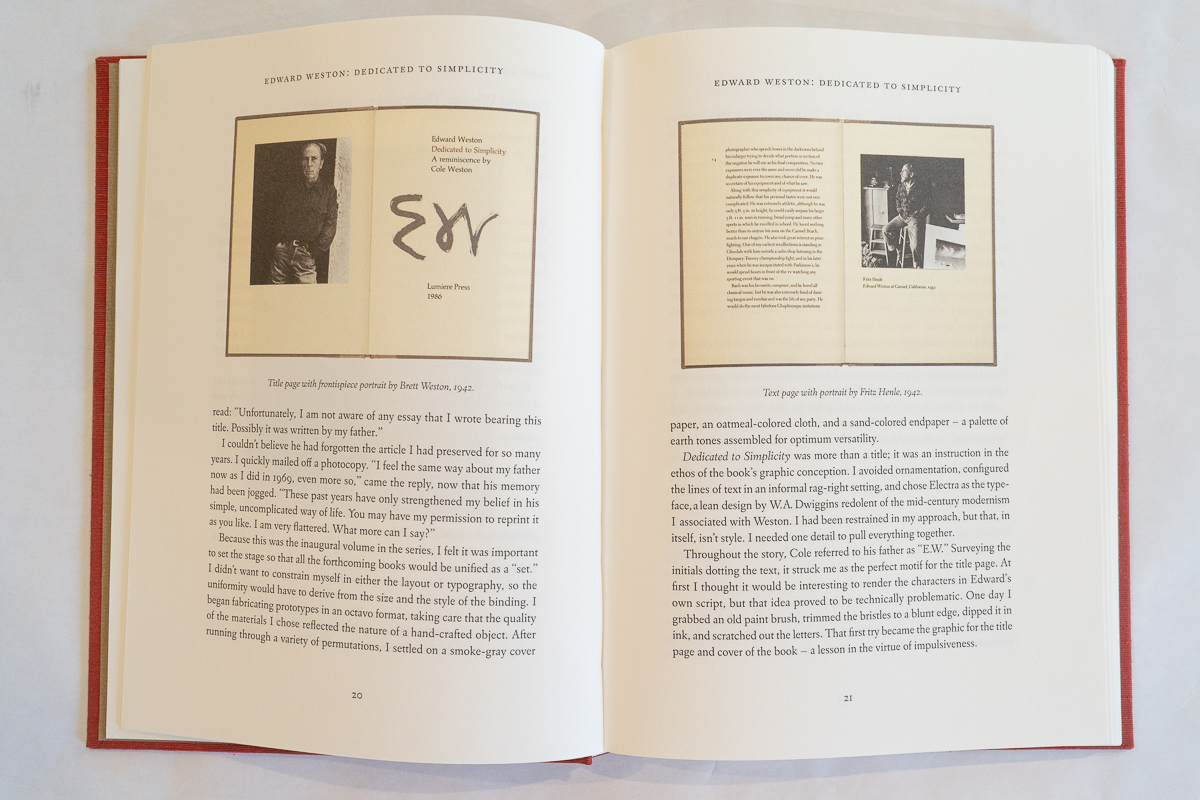
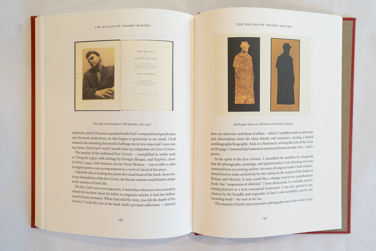
The pages are printed on Mohawk Superfine paper with an eggshell finish, providing an ideal surface for both text and image. The Linotype Eldorado font, based on a 1950 typeface design by W. A. Dwiggins, embodies the optimism and artistry of postwar America. Its subtle, elegant serifs make it highly readable while complementing the imagery throughout the book. Particularly effective is the use of contrasting colors on the title pages introducing each artist. The red titles over black text seem to connect visually with the facing photographs, subtly emphasizing the transition from one artist’s story to the next.
Torosian’s descriptions of creating these books reveal how artistic vision evolves and how, as he notes, process informs aesthetic. The photographs selected for Printer Savant are drawn primarily from the twenty-two-volume series, offering readers a concise yet revealing glimpse into the larger body of work and into Torosian’s creative vision.
The book also contains valuable insights for artists and creatives. Torosian recounts searching for a typography book only to discover the work of Calder, leading him to conclude that fixation on a single medium (like typography) can create tunnel vision. One of my favorite moments comes from his discussion of a recorded interview with Gordon Parks and what he calls the “theater of memory.” In many ways, that idea captures the essence of this book. Printer Savant becomes a theater of memory, transporting readers to another time and place alongside the photographers, writers, and artisans who created these remarkable objects of art.
This is a wonderful book and a genuine work of art. Limited to just 400 signed copies, it deserves a permanent place on anyone’s desk. There it serves not only as a beautiful object but also as a portal—back to the printing press, to the artists who inspired it, and to Torosian’s remarkable journey among his creative mentors.
__________
Lee Halvorsen is assistant editor, writer and visual artist living in Virginia.
__________
Lumiere Press: Printer Savant & Other Stories by Michael Torosian
Artist: Michael Torosian working in Toronto, Ontario, Canada
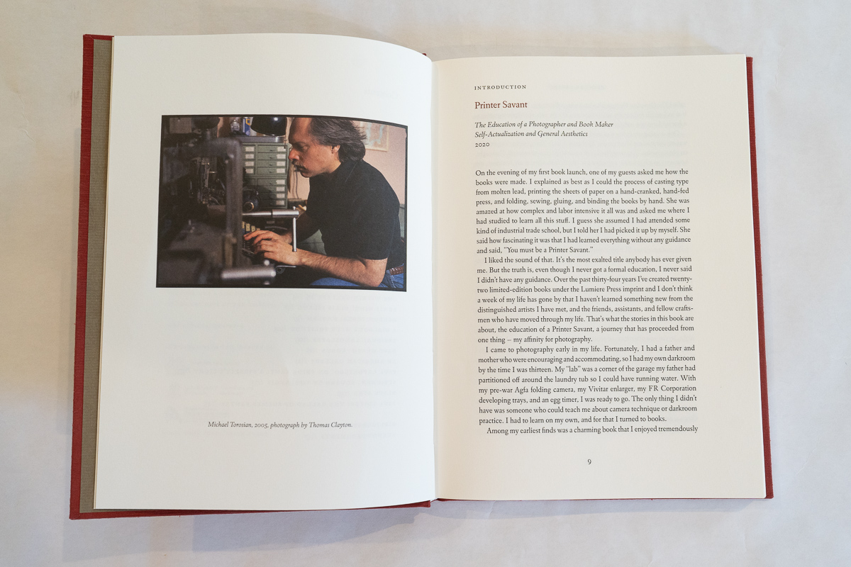
Introduction, Printer Savant: Michael Torosian
Copyright images and text Michael Torosian ©2022,
Photographs © The Photographers or Their Estates Under The Date Of Their Original Publication
Publisher: Lumiere Press, Toronto
Digital Image preparation by the Gas Co., Toronto
Offset Lithography CJ Graphics, Mississauga, ON
Designed and Handbound by Michael Torosian, Lumiere Press
The 92 illustrations are reproduced on 10 micron stochastic four-color offset lithography.
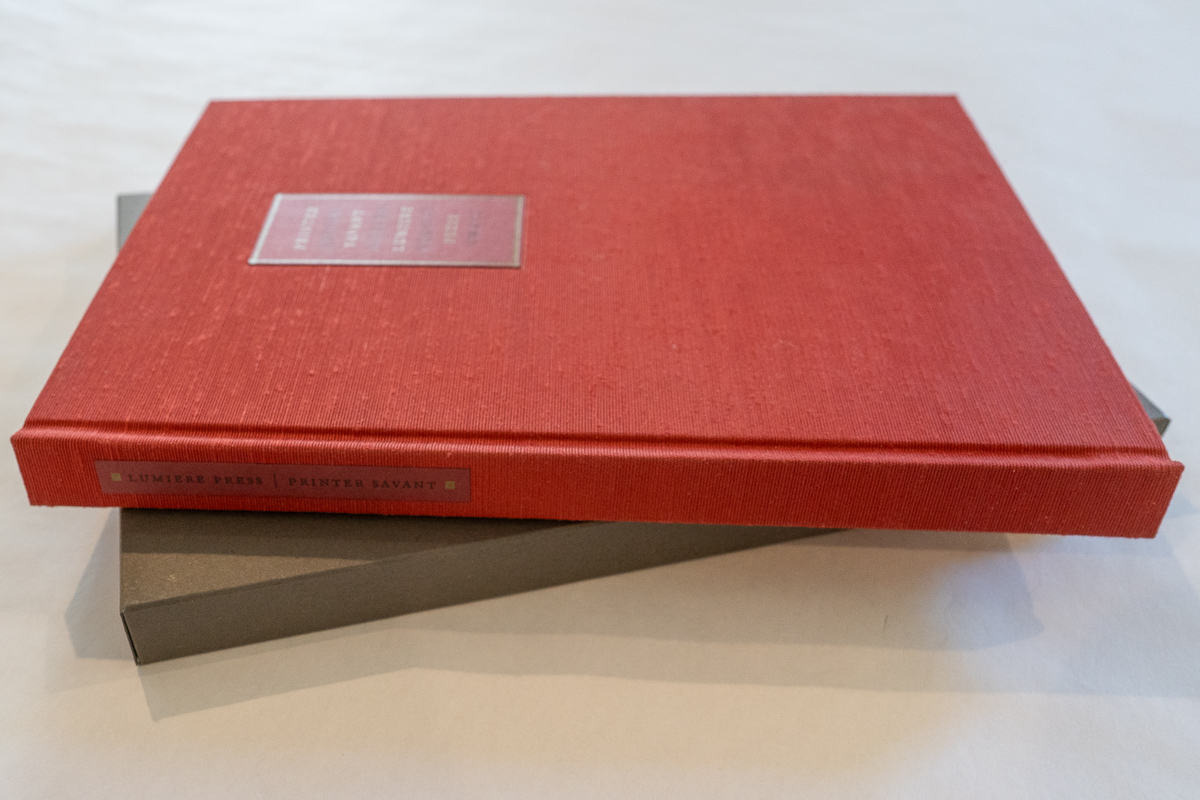
Binding: Handmade embossed cover, cast in lead type. Delivered in slip cover.
Language: English
Hardcover 168 pages, 92 illustrations, limited to 400 numbers, signed editions and a variant edition of twenty-six copies accompanied by an original gelatin-silver print “Cubist Man” by Michael Torosian. 7 3/8 x 10 inches, ISBN 978-0-921542-20-0
__________
__________
Articles and photographs published in the PhotoBook Journal may not be reproduced without the permission of the PhotoBook Journal staff and the photographer(s). All images, texts, and designs are under copyright by the authors and publishers.

Leave a comment