Review by Wayne Swanson •
“Were it not for.” What a perfect phrase for our Trumpian times. With these four words you can claim responsibility and assess blame. Deflect accountability, cast aspersions, or simply cover your ass. To “control the narrative” is the goal. In Michael Ashkin’s hands, the four words turn deadpan images into ominous scenes of fear and loathing.
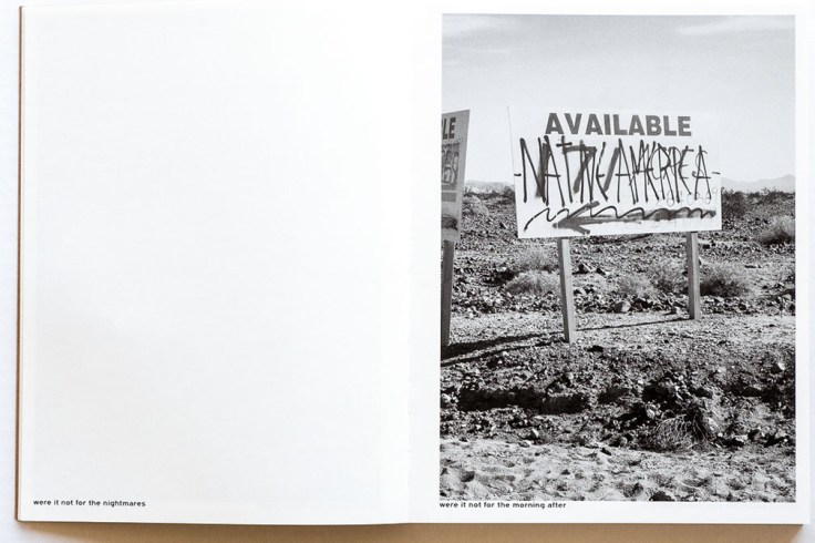
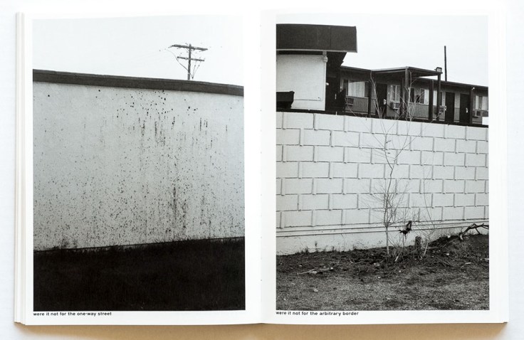
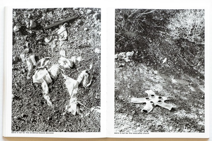
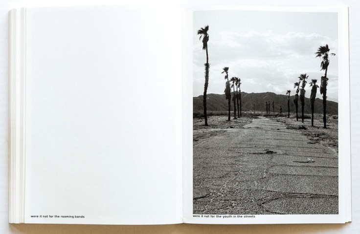
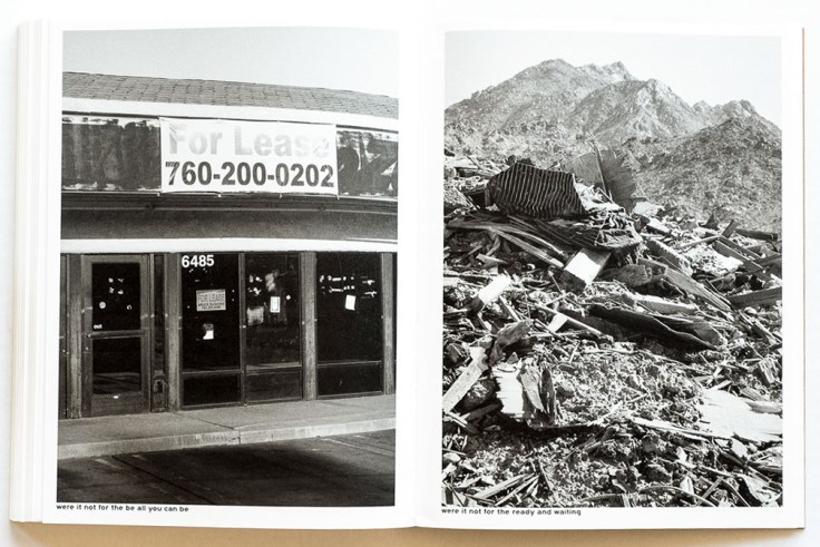
Ashkin is a multi-media artist whose work addresses issues of landscape and urbanism. In were it not for he takes on the American idea of manifest destiny as it continues to play out in seemingly inhospitable areas like the deserts of California. The book consists of 218 stark New Topographics-style photographs of human development in the Mojave Desert: a dirt road heading up a hill, debris strewn across a barren field, drab stucco buildings, an empty lot behind a chain link fence…
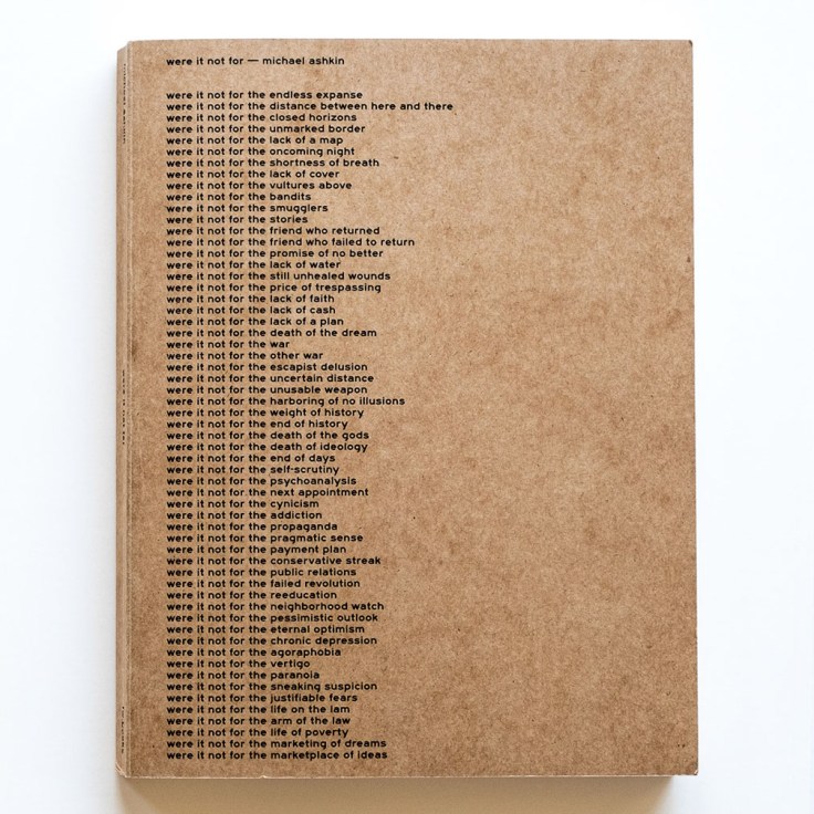
Nothing to see here. Except that each black-and-white photo has a caption that includes the toxic “were-it-not-for” qualifier: “were it not for the questionable priority,” “were it not for the unimaginable end,” “were it not for the power alliance”… The book opens with six full text pages of these qualifiers and closes with one more page of them. When you add in the captions that are paired with the images, it totals 670 portentous phrases.
Some of the image/caption pairs conjure immediate associations, like a shot of multiple tire and tractor tracks marring a hillside paired with the caption “were it not for the media circus.” Others are more obscure, or seemingly non sequiturs, like a water fountain on a cinderblock wall paired with “were it not for the unwritten history.” Yet they all contribute to the foreboding effect. And as they pile up, they transform perception and create an atmosphere of unease.
Ashkin has said that “Both the text and photos show what the ‘California Ideology’ has produced in our world. A situation where ‘anything is possible’ has produced its opposite. And it is not as if we have gotten to the bottom of this ideology, which, of course, is its own variant of hypercapitalism.”
Were it not for Ashkin’s dry, understated execution, it all might come across as a one-note joke. But his points about the consequences of endless development come through in his images, and the words have the power to reshape the meaning. A picture may be worth a thousand words, but Ashkin shows us how just a few well-chosen words can dramatically alter perception of any picture.
_____
were it not for, Michael Ashkin
Photographer: Michael Ashkin, born Morristown, New Jersey, and resides in New York, USA
Publisher: Fw:Books, (Amsterdam, NL, copyright 2019)
Writing: Michael Ashkin
Text: English
Softcover book, perfect binding, tritone lithography, 256 pages, 8 ½ x 11 inches, printed in Netherlands
Designer: Hans Gremmen
__________________________