
Review by Steve Harp •
When I was younger and traveled more frequently, some of my favorite places to photograph in foreign countries were grocery stores. The items on the shelves – daily staples of life – were recognizable but different: packaging, the numbering units for pricing and size, the product names. They were uncanny in the sense of being familiar, while at the same time fundamentally unfamiliar.
Johannes Groht speaks to this sense of strangeness in the introduction to his 2021 monograph, Nice Not Nice:
“In a foreign city, I first orient myself by things that look familiar . . . signs and symbols I can understand. Some I’m sure I understand differently than they are meant, and some I deliberately misunderstand.”
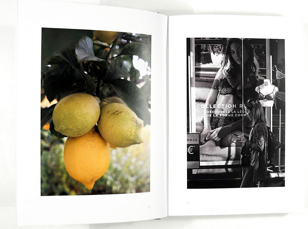
In fact, this book revolves around the tension between the familiar and the strange. “The English word ‘nice’ is currently a fashionable word in Germany,” Groht writes in the introduction. The book’s text, in fact, is in German (Groht provided me with a translation for this review) and with these photographs, primarily of the French city of Nice, Groht seems to be setting up something of a game for himself (and, of course, the viewers). “Is Nice nice?” he asks. A German photographing in France, thinking of an English word currently fashionable in German slang, popularized by an English band singing, “So nice in Nice…“ The familiarities and strangenesses interweave and multiply.
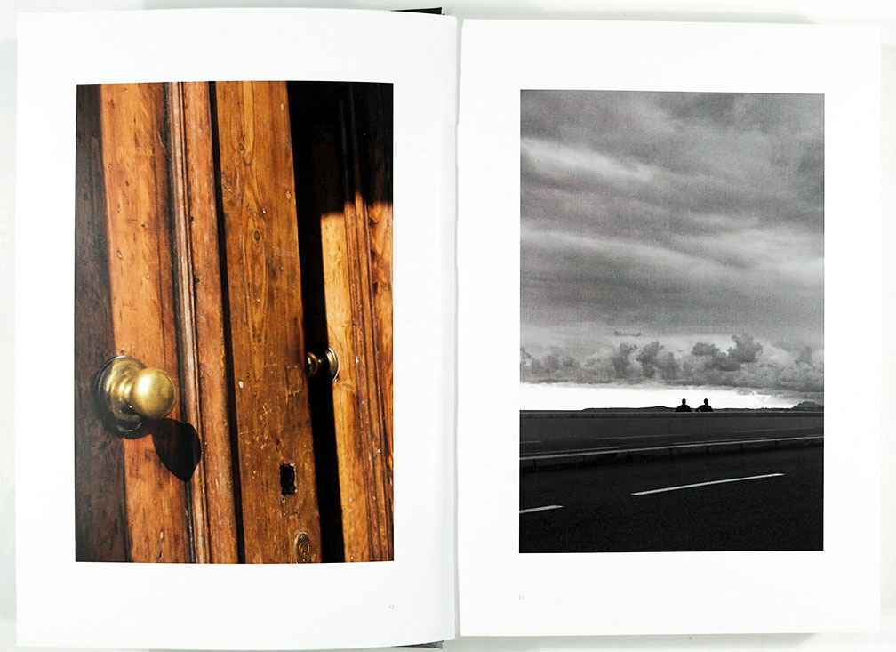
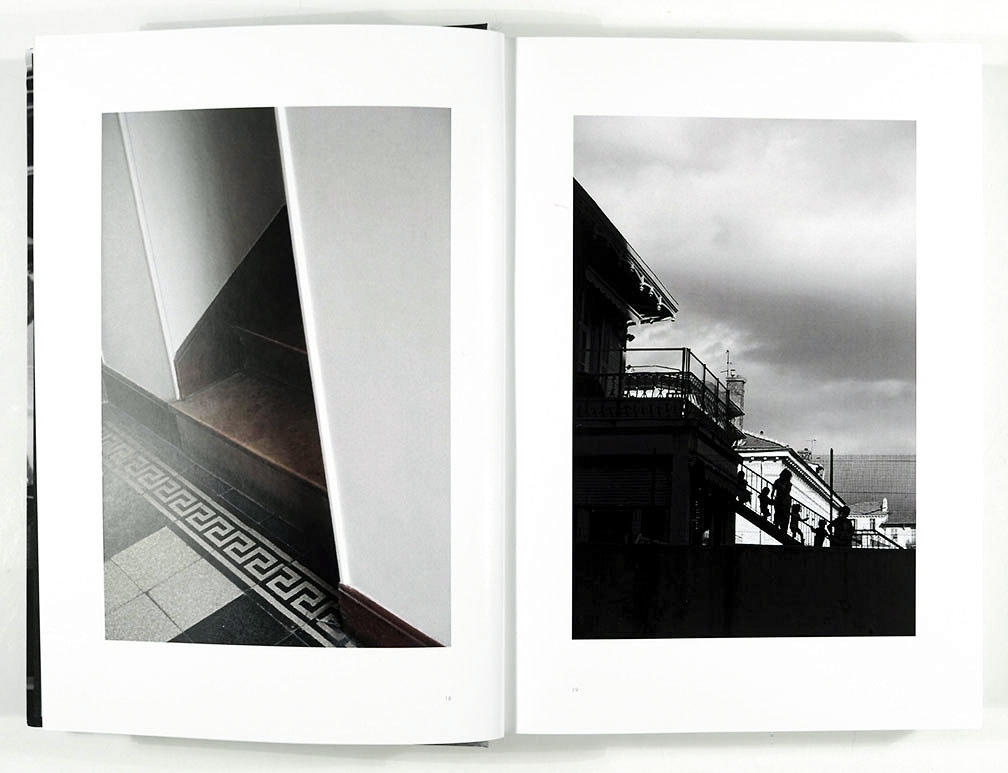
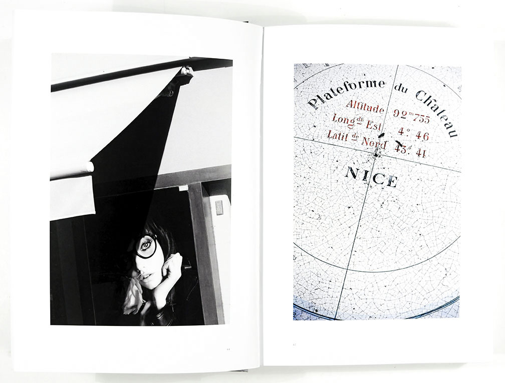
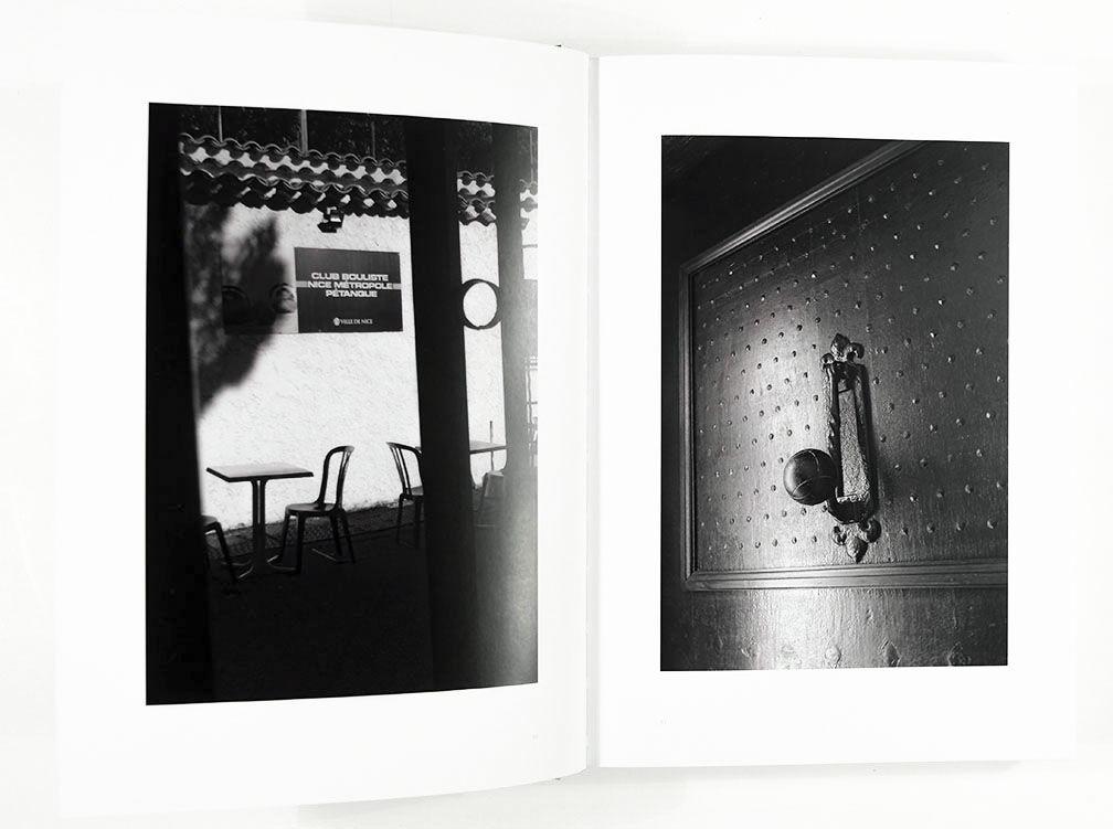
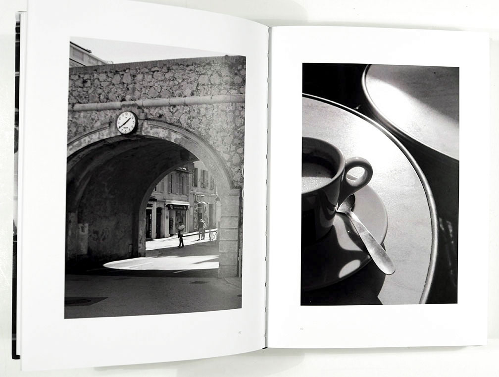
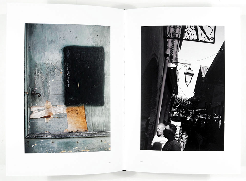
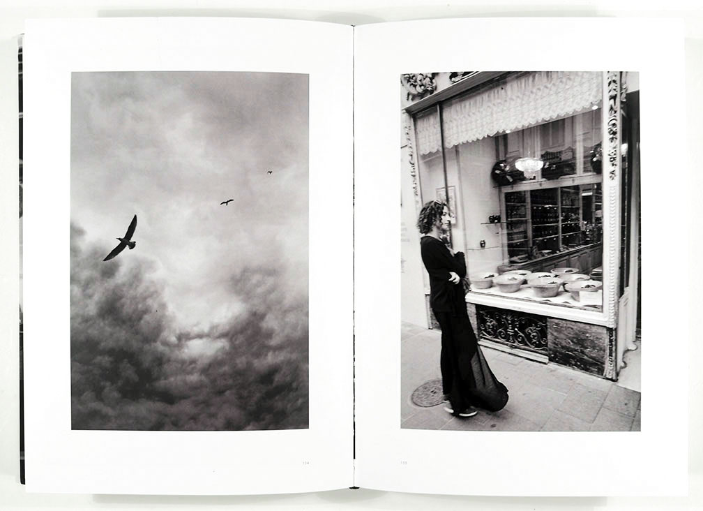
The photographs in Nice Not Nice depict the city as a place of mystery precisely because of their quotidian recognizability. For every façade draped in shadows, interior staircase leading to a closed door or ambiguous reflection in a shop window we are also given an image of an urban walker, tables outside a café, sunbathers on a beach. The strange mixing with the familiar renders the familiar strange as well.
The photographs themselves are formally engaging and well composed. Groht clearly knows how to organize the frame and manipulate those fundamental materials of photography – line, form, scale, the play of light and dark such that each image is in and of itself compelling, an engrossing construction of space drawing the viewer in. This visual mastery has the effect of deepening the underlying sense of mystery by reinforcing the visual anonymity of place. To this North American viewer, the place reads simply as “European” (specifically francophone, given the signage visible in certain images) but nothing more specific than that. The book is documentary while, at the same time, not a document in that we don’t really know what is being documented. I’m reminded of Ian McEwan’s novel, The Comfort of Strangers, the city – though clearly suggesting Venice – remains resolutely unnamed and anonymous. Or the two city-states, Beszel and Ul Qoma, in China Mieville’s The City and the City, located “somewhere on the edge of Europe.”
Paradoxically, the strangeness of Groht’s approximately 230 photographs of sun-dappled Nice is amplified by the uniformity of the book’s presentation. Measuring approximately 7” x 10”, the photographs are presented side by side across the pages, each image 4 ¾” x 7” with uniform white borders. The book is divided into 17 sections, each opening with an image on the right and concluding with an image on the left. A blank white page separates each section. The images are a mix of color and black and white, though predominantly black and white. A few of the color images are highly saturated, but most are so muted they seem almost monochromatic. The book is bound in a hard imagewrap cover. It’s a substantial, solid volume, nearly 1 ½ inches thick.
This book makes me think of an atlas – a bound collection visually representing a given subject. Gerhard Richter’s Atlas project comes to mind, of course, particularly its published version of uniformly gridded images. But Nice Not Nice is not gridded and its uniformity is of a different sort, though it is indeed a kind of collection. It is as homogeneous as Richter’s is heterogeneous. I’m reminded, also, of a photographic work very different work from Richter, that being Ralph Gibson’s trilogy, The Black Book (which collects The Somnambulist, Deja-Vu and Days at Sea). Many of the cryptic scenes included in Gibson’s trilogy recall for me images in Nice Not Nice, but Gibson’s work strikes me as inherently narrative, a story in which certain plot elements are being withheld. Like a dream, which Gibson’s work is often compared to.
In his book The Tears of Things, Peter Schwenger contrasts an “art of daily life” that “reinforces the viewer’s world, that presents the ‘already seen’ “with “works that bend and break the viewer’s sense of ‘world,’ that reveals the gap that was always there.” Groht’s book seems rooted in these mysteries of the world around us, the world we pass through all the time, riven by gaps perhaps only visible to the observing stranger. We might think of Groht as a kind of flaneur, an urban wanderer but one not seduced by spectacle but by strangeness, that unsettling sense that what seems familiar or recognizable is, instead inherently confusing. Groht’s world, the world of “Nice,” is made more mysterious by the confusions of language. The viewer moves through a world in which it is unclear how language is working. Rather than orienting, it dislocates.
In the introduction, Groht writes:
“On a walk in the Old Town, near the Opera, I came across the Patisserie Blanc. In one of their shop windows were two printed tin cans. “Nice” was written on them – like on a place-name sign at the city limits. The writing on the second tin, “crossed out” by the edges of the glass display case, pointed – like the back of the town sign – beyond the city limits into the surrounding area.”
Unsure where “Nice” is pointing, or what it’s pointing to, the viewer is left to wonder: is Nice nice?
____
Steve Harp, Associate Professor The Art School, DePaul University
____
Nice Not Nice, Johannes Groht
Johannes Groht, born Hamburg, Germany; currently resides Hamburg
Self-published, Hamburg, 2021
Essays: Johannes Groht and Bernard Plossu
Text: German
Hardcover Imagewrap, thread-stitch binding, digital four-color printing, coated matte paper, printed in Krumbach, Germany.
Photobook designer & editor: Johannes Groht
_____


Articles & photographs published on PhotoBook Journal may not be reproduced without the permission of the PhotoBook Journal staff and the photographer(s).
