
Review by Gerhard Clausing •
In this day and age of easy digital switching between the black and white and color renderings of any particular image, it is hard to imagine how an early advocate of color photographs had to carry two distinct cameras for the purpose of creating both types of images. Yet that was the situation of young Joel Meyerowitz in the early 1960s. Not only that, but color was frowned upon by a lot of members of the art world, and it took many years for it acquire the status it deserves.
In this photobook we are able to see not only the early work of this renowned photographer, but also the differences in impact of color versus black and white from an interpretive standpoint. We are also able to read the photographer’s thoughts about the subject as well as valuable historical notes and analyses by Robert Shore that show us the photographer’s developmental journey. We are able to share a lifetime of photographic and personal experiences, both in Europe and in the United States.
The book is divided into five parts: “Early color,” “First pairs,” “On the road in Europe,” Return to America,” and “Letting go and moving on.” Below, I am showing nine double pages from the book which illustrate some specific points. The book takes us from the photographer’s first discovery of color as a more vibrant and immediately accessible artistic vehicle (large projected slides versus small images on contact sheets) to a time in which color photographs were accepted as a less historical, more reality-oriented, and less abstract way of representing the world.
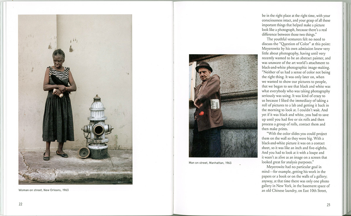
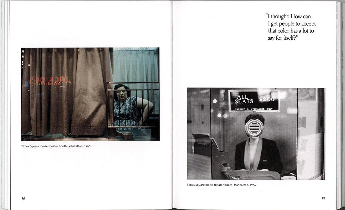
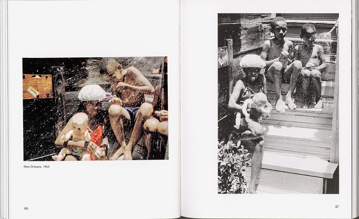
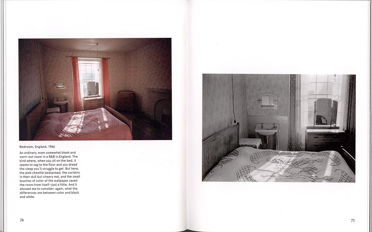
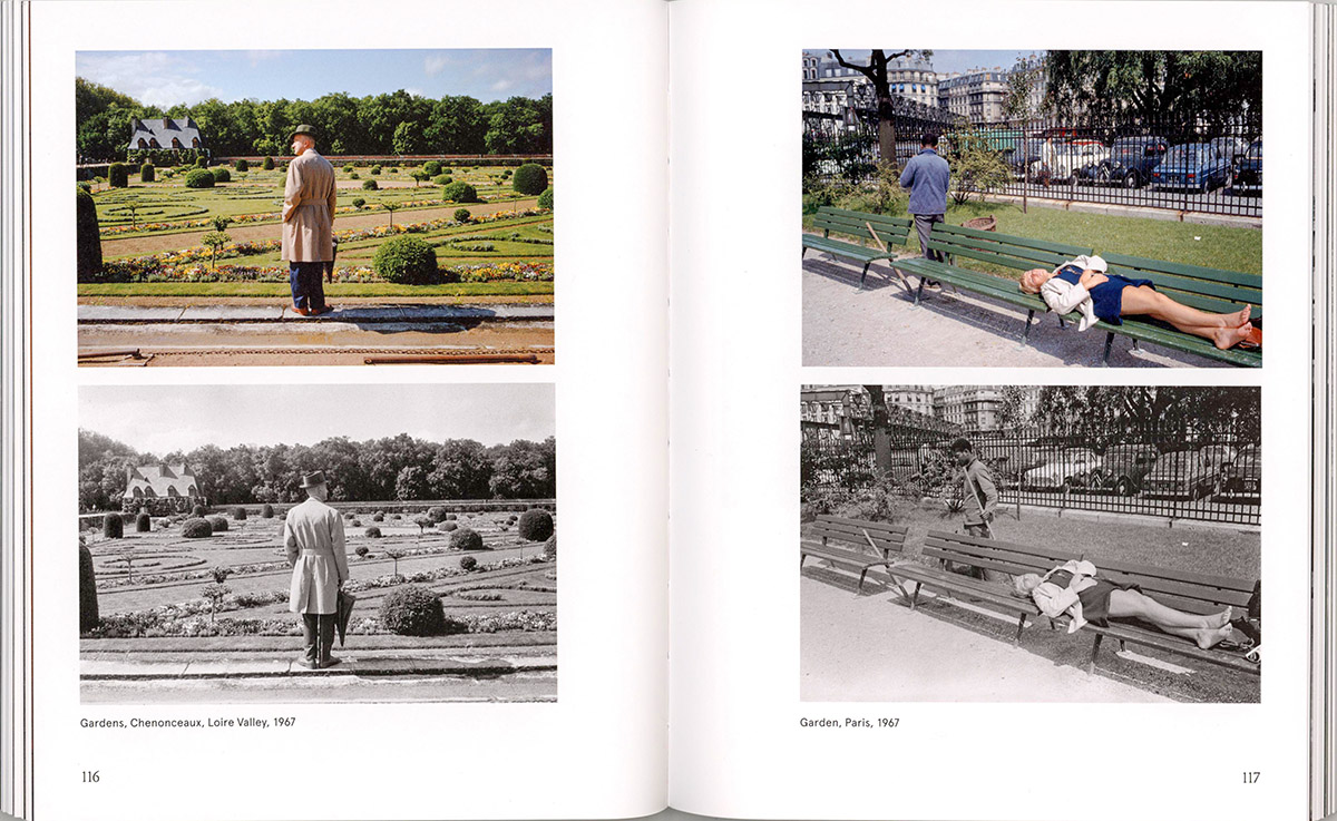
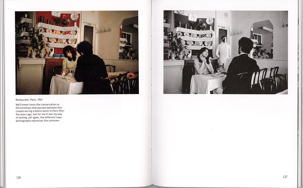
We appreciate that Meyerowitz, a superb chronicler of life on the streets, approached color photography with some caution in the early days. Where we see the same subject in black and white and color, we can also notice a somewhat different approach to each of the two media, to achieve maximum effect, such as the pictures of the ticket sellers. The pictures of the kids drenched by water on a hot day clearly shows the value of the two different modes, as do the two pictures of the bedroom, where there is clearly a greater emotional impact brought about through color in each of the two sets. Similarly, the garden pictures have a different impact on us, depending on the mode, and affecting the mood. In the case of the restaurant image, more cultural information is transmitted in the color photograph.
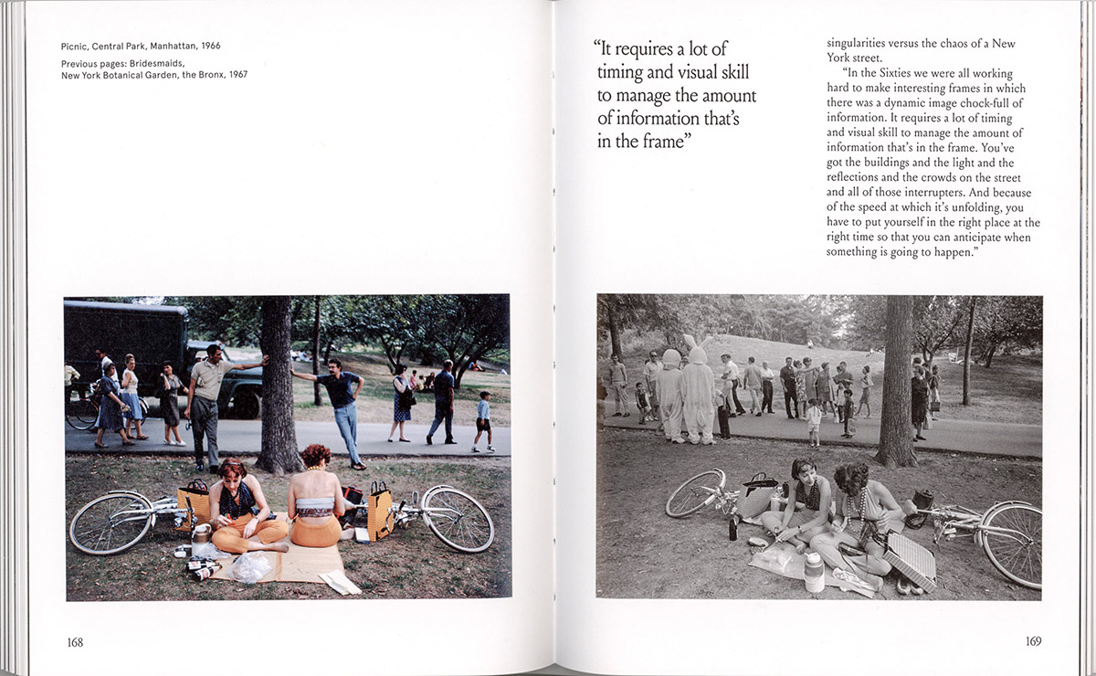
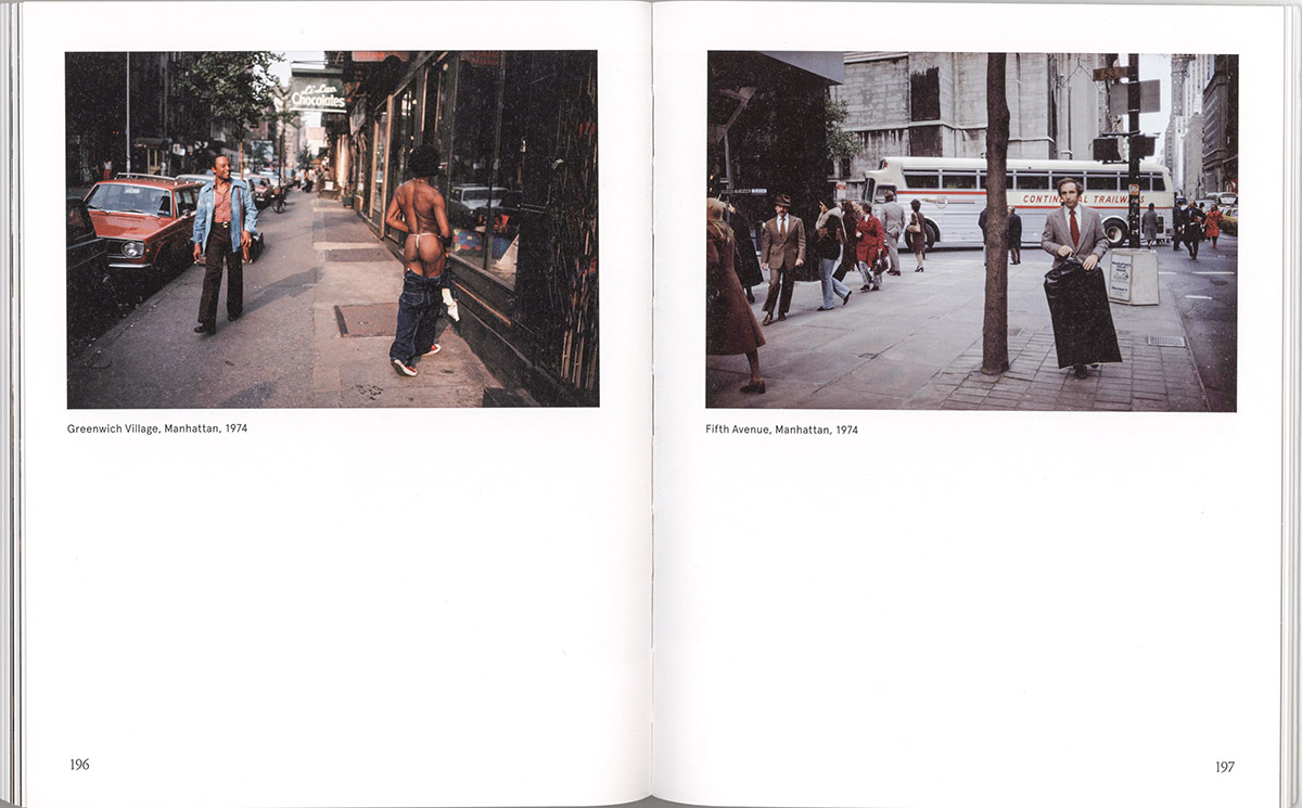
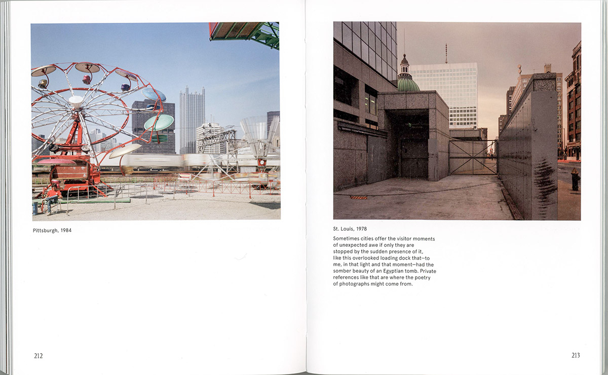
The Central Park photographs also illustrate the meticulous attention that Meyerowitz paid to composition of a complex scene within a particular frame. The judicious use of color in the two New York City photographs contrasts two distinct moments in two distinctly different parts of town. We also can study many images where he uses color to transmit a certain mood, such as the liveliness of an entertainment area versus the gloominess of an industrial section of town. The layout and design of the book are quite pleasant and varied, so there is much encouragement to discover many things.
This photobook is a unique textbook, covering many subjects in addition to the purpose and value of color: photography in general, composition, personal choices, cultural content and change, and indeed life itself. I have been able to feature only a few of the highlights; there is much more for you to see, read, and think about. I strongly urge you to obtain this photobook and study it in detail. We all can all learn a great deal from Joel Meyerowitz.
____________
The PhotoBook Journal previously reviewed REDHEADS by Joel Meyerowitz.
____________
Gerhard (Gerry) Clausing, Editor of the PhotoBook Journal, is an author and photographer from Southern California.
____________
Joel Meyerowitz – A Question of Color
Photographer: Joel Meyerowitz (born in the Bronx, lives in New York City and Italy)
Editor: Robert Shore
Publisher: Thames & Hudson, London and New York City; © 2023
Texts: Joel Meyerowitz and Robert Shore
Language: English
Softcover, illustrated, sewn; 224 pages, paginated, with 194 photographs; 6.875 x 8.5 inches (17.5 x 21.5 cm); printed in Italy by Printer Trento SrL; ISBN 978-0-500-29789-6
Photobook Designer: Matt Curtis
__________
Articles and photographs published in the PhotoBook Journal may not be reproduced without the permission of the PhotoBook Journal staff and the photographer(s). All images, texts, and designs are under copyright by the authors and publishers.

Leave a comment