Review by Lee Halvorsen •
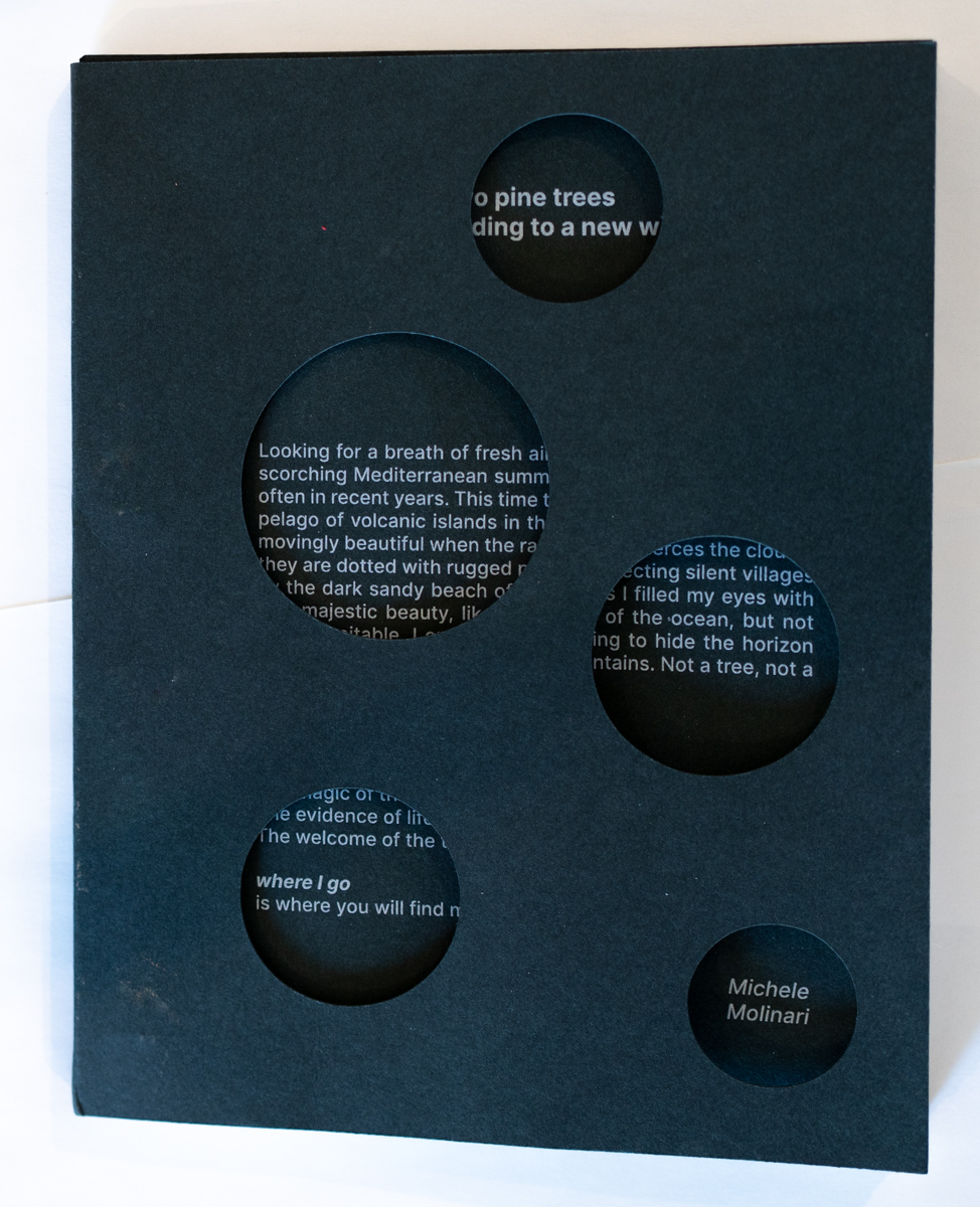
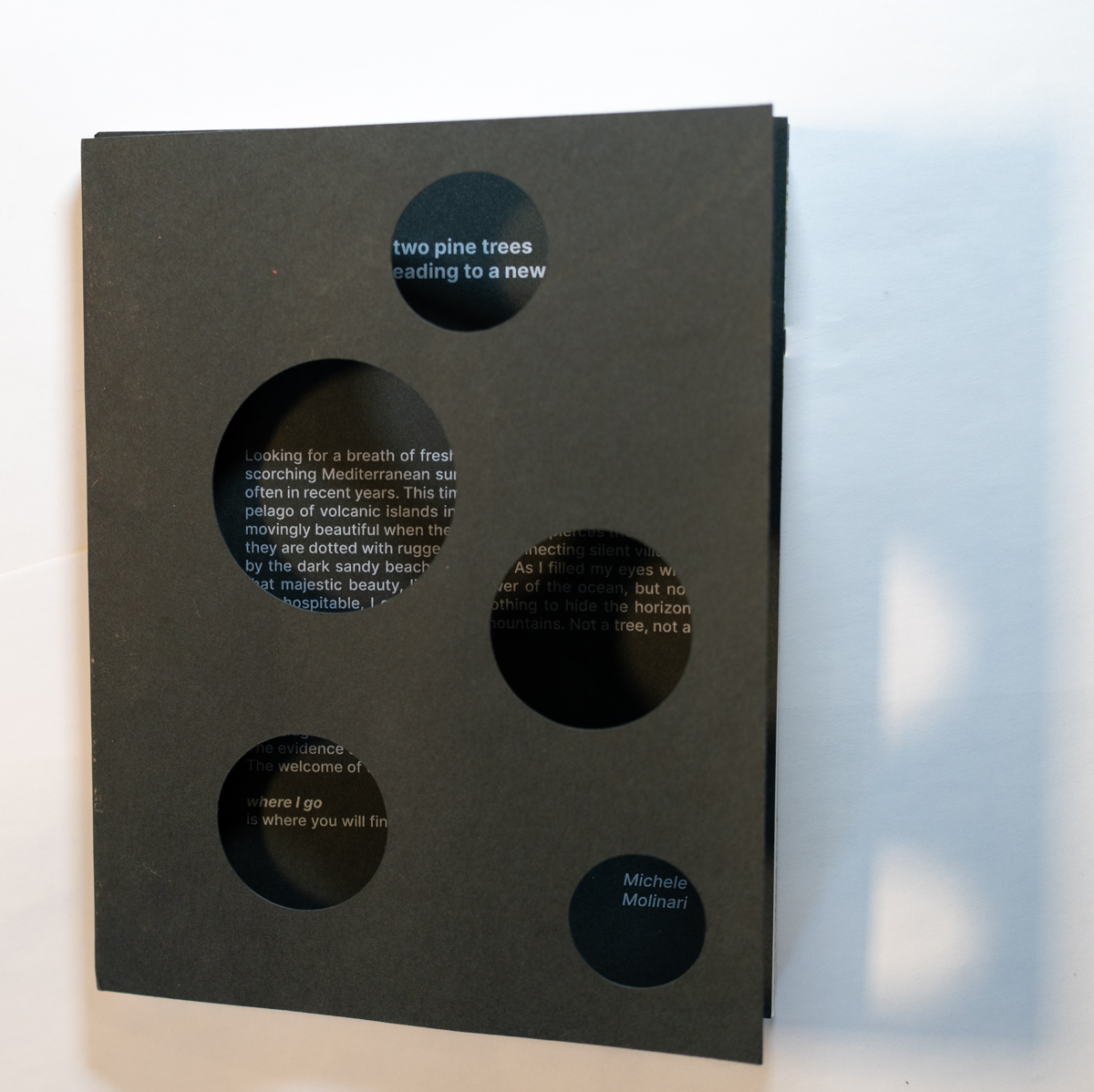
The physical form of the book is art and brings a tactile dimension to Michele’s visual story. The cover is dark green, heavy paper die cut with five circles of different sizes. The circles in the cover create a pinhole effect on the gray print of the next page’s introduction, a shadowy sensation of entering a forest with sunlight filtering through the leaves, what the Japanese call “komorebi.” The compact size of the book and the fastener binding suggest the book is meant to be portable, to be easily accessed during barren experiences needing an uplifting moment, image, and thought.
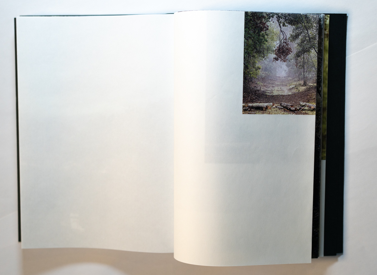
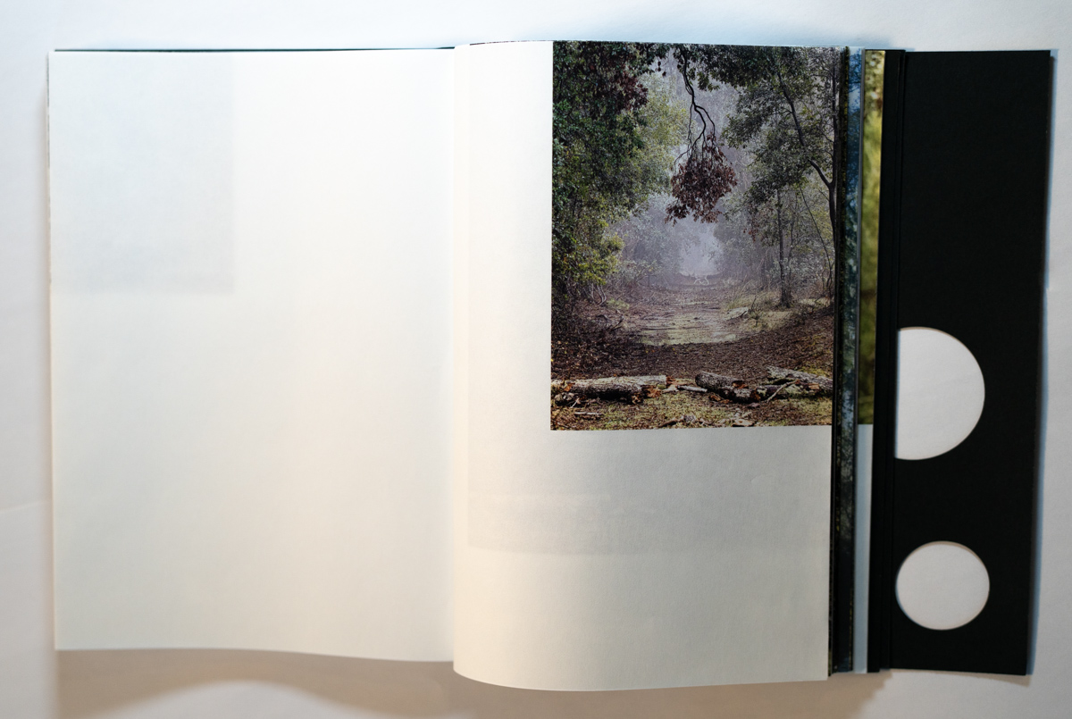
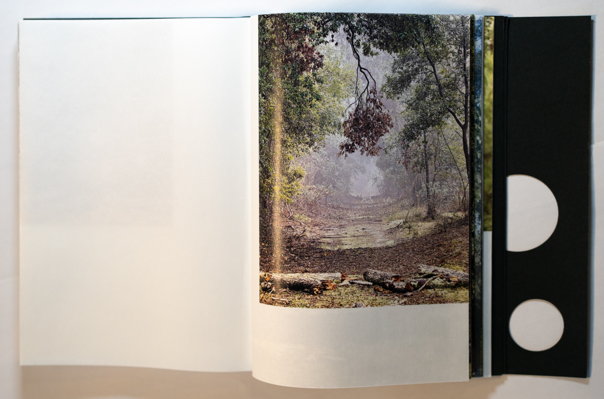
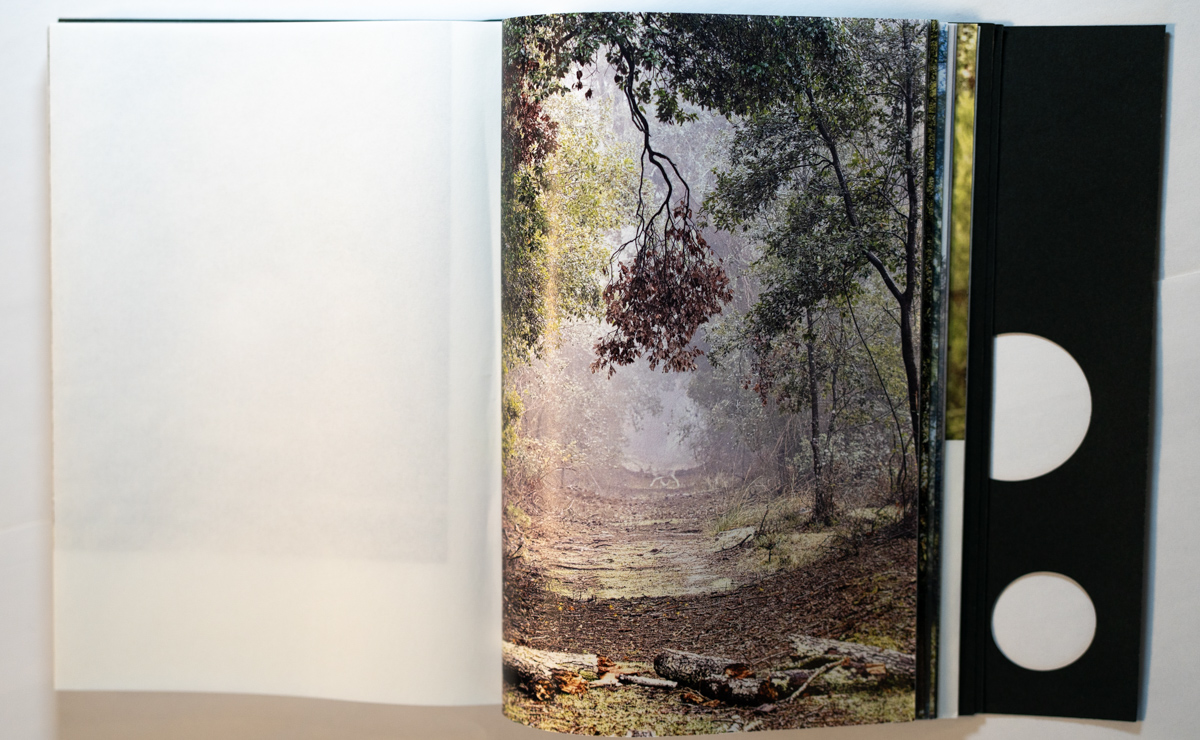
The page paper is thin, almost transparent, with a silky, leaflike texture. The pages are doubled, that is, folded in half and punched on the short side for the two fasteners. Printed only on the outer fold, the density of the folded paper reduces the transparency of the view so only a sense of what is on the next and previous page is available, not a clear outline. The fold, the texture and the image positioning create a very sensory experience with each page turn.
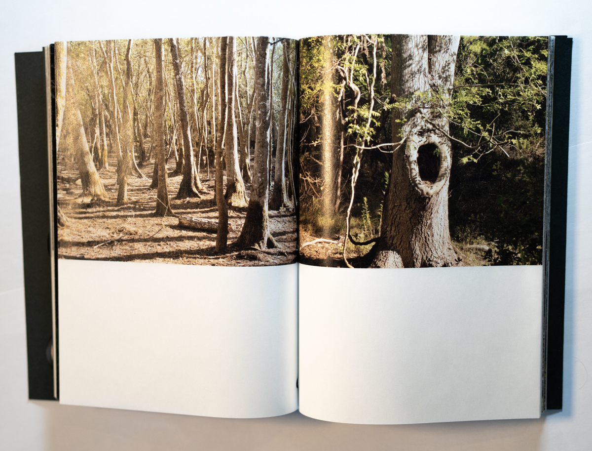
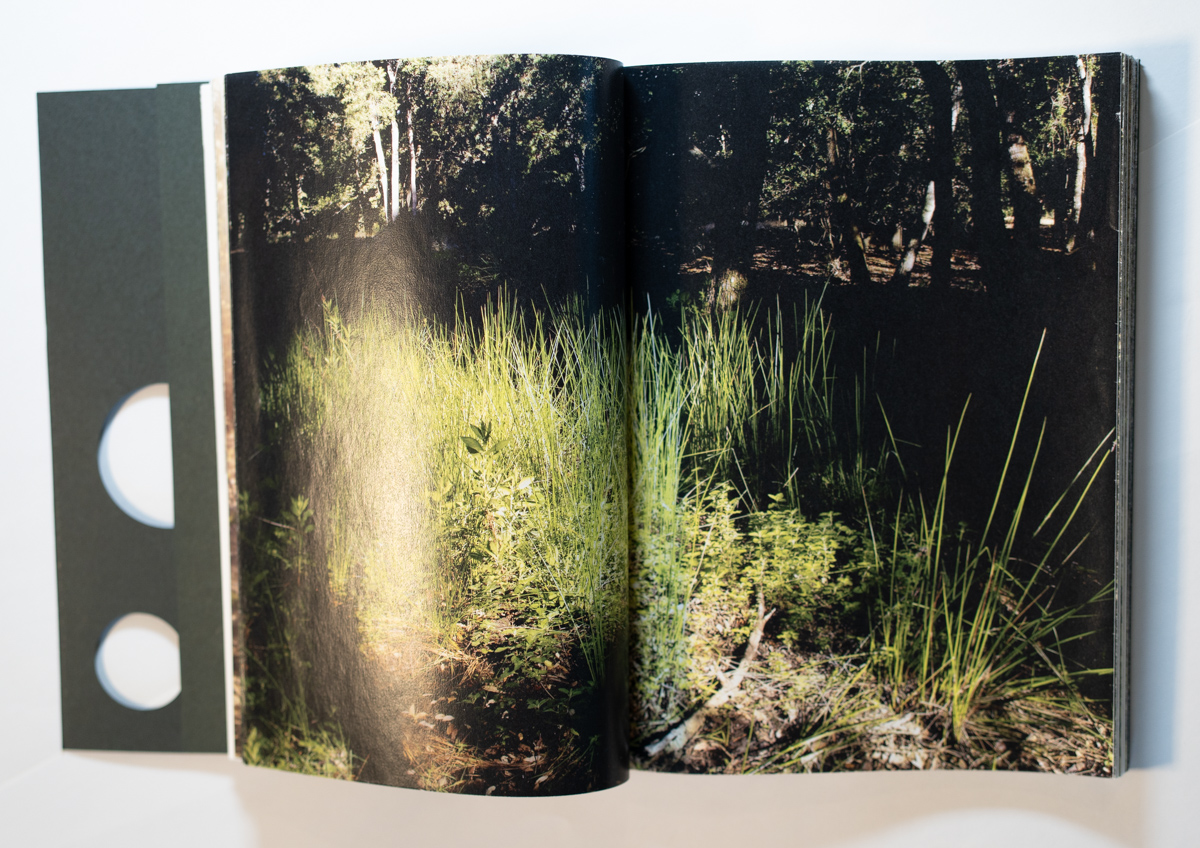
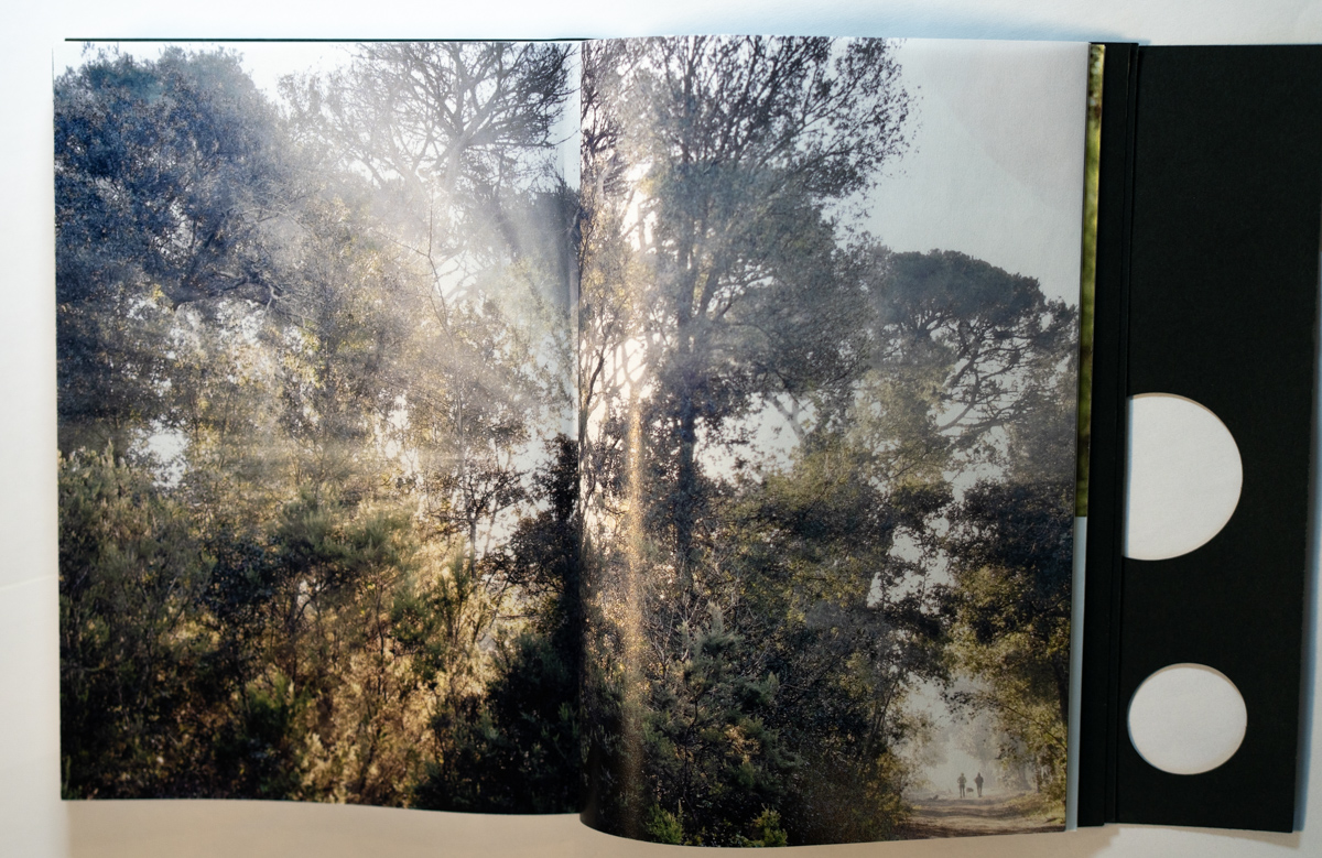
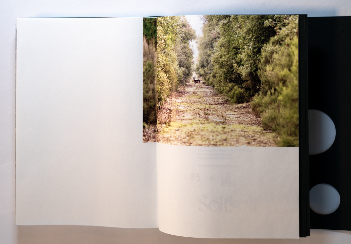
The book has a very brief introduction in English, repeated in Italian at the end of the book with the copyright page. All other pages are images or left blank. The imaginative and somewhat unusual image layout design continues the theme of the forest’s light, its leaves, and the reader’s immersion into the trees. The images are trees, trees, and trees all gently coming from the page presented to the reader in different sizes, different positions, some “bending” from one page to the following on the opposite side. The positioning and size differentiation reminded me of leaves falling to the ground and light streaming through the leaves.
Some images are small, followed by the same view in a larger image, and then again in a still larger image. A sense of walking through the forest is natural and that’s what I imagined with each page turn. The images remind me of scenes in a forest walk that I would stop to enjoy…sunrise surrounding the trees, fog lifting gently from the ground, mossy arches of trees bending to age and trauma.
Going through this book was a joy, almost a meditative experience, it doesn’t beat being out with the trees, but it’s close.
Lee Halvorsen is assistant editor, writer and visual artist.
____________
Michele Molinari – where I go
Artist: Michele Molinari, born in and currently based in Mantua, Italy.
Book Design: Andrea Galbusera
Publisher: Selfself Books ©2025
Images/text: Michele Molinari ©2025
Language: English and Italian
Paper cover, 112 pages Oriental quarter bound with 4+4 printing, printed on Sixties 60gr paper; fastener bound, 17cm x 22cm, ISBN 979-12-80653-44-4. Cover; Gmund Colors Matt 60 300gr with die cut; inside first and last sheet Gmund Colors Matt 600 100gr. first edition limited to 35 copies
Printing: Stamperia Inchiostro Puro, Turin, Italy.
____________


____________
Articles and photographs published in the PhotoBook Journal may not be reproduced without the permission of the PhotoBook Journal staff and the photographer(s). All images, texts, and designs are copyright of the authors and publishers.
